
R Statistical Visualization: Univariate, Multivariate, and Functional Data Graphics

The notes will follow the structure of the book Modern Statistical Graphics, supplementing the content of Data Visualization: Based on the R Language - Joa Junping; for convenience and cross-cutting with other knowledge structures, they will eventually be presented in the form of a Markdown in OBSIDIAN;
Fortunately, the MSG package provides us with all the graphics we need to build the notes, and we do not need to rewrite all the codes we need to get the graphics we need;
Based on the structure in modern statistical graphics, we divided the entire note into three main parts, each presenting the statistical drawing itself, presenting the various statistical graphics in a dictionary, and finally some of the statistical drawing modules in R.
We choose to move the rest of the library to R Graph Studying ideas and methods in it.
Single Variable Chart
Starting with this chapter, we're going to present the diagram of statistical graphics, and we're going to make a broad classification by variable structure; we're going to want to be able to give a detailed description of all the graphics, the analysis methods, and including...base R and ggplot2 Code Achieved
Of which graphics are usually only usedbase RIt's an example of a slightly different view; ggplot2 We'll just leave it here for reference.
In terms of code realization, we don't explain parameters in detail, but we just describe the features of the function, and we can use more of the changes we need.help
The single variable diagram is designed to show a single variable, and we sometimes compare multiple single variables, but still falls within the single variable diagram (although multiple variables are used).
Bar Chart
The barchart is currently the most widely used of all statistical graphics, but the barchart shows relatively poor statistics: It shows the original values only by the length of the rectangular bar, without any summary or extrapolation of the data.
Basic introduction
The function of the barchart in R is barplot()
- Core parameters
heightSpecifies the length of a long bar to accept a numerical vector or matrix, which is the most basic bar map in the case of an accepted numerical vector. If he accepts the numeric matrix, he's drawing each column as one, and at this point he's going to bebesideParameter Control - Parameters
besideSet to FALSE, each column of the matrix takes onebesideSet to TRUE without stacking horizSets the direction of the chart.
Graphics Example
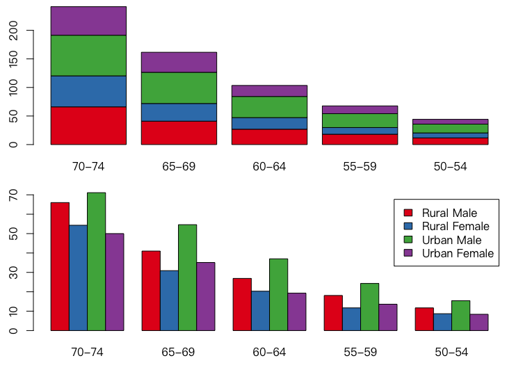 It's been modified.
 beside Parameters
base R
## 基础作图法绘制弗吉尼亚死亡率数据条形图
data(VADeaths)
library(RColorBrewer) # 用分类调色板
par(mfrow = c(2, 1), mar = c(3, 2.5, 0.5, 0.1))
death = t(VADeaths)[, 5:1]
barplot(death, col = brewer.pal(4, "Set1"))
barplot(death, col = brewer.pal(4, "Set1"),
        beside = TRUE, legend.text = TRUE)
ggplot
## ggplot2 绘制弗吉尼亚死亡率数据条形图
library(ggplot2)
library(patchwork)
data(VADeaths)
reshape_VADeaths = transform(
  expand.grid(sex = colnames(VADeaths), age = rownames(VADeaths)),
  rates = as.vector(t(VADeaths))
)
p = ggplot(data = reshape_VADeaths,
            aes(x = age, y = rates, fill = sex)) +
  labs(x = "年龄", y = "死亡率", fill = "性别") +
  scale_fill_discrete(labels = c("农村男性", "农村女性",
                                 "城市男性", "城市女性"))
p1 = p + geom_col(position = "stack")
p2 = p + geom_col(position = "dodge")
print(p1 / p2)
Cleveland Point
The functions of the dots and bars are very similar: the length of the bar represents the size of the value and the position of the point of the dot indicates the size of the value, which can be exchanged almost in any case.
Basic introduction
The function of the mid-point chart for R is dotchart()
- Parameters
xand in the bar chartheightConsistent needs
Graphics Example
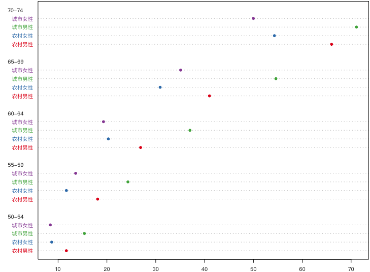 It can be seen as just changing direction.
Very little is used because it doesn't have a bar chart intuitively, and it's only possible when the number of points is small.
It can be seen as just changing direction.
Very little is used because it doesn't have a bar chart intuitively, and it's only possible when the number of points is small.
base R
## 基础作图法绘制弗吉尼亚死亡率数据的 Cleveland 点图
library(RColorBrewer)
data(VADeaths)
colnames(VADeaths) = c("农村男性", "农村女性", "城市男性", "城市女性")
par(mar = c(2, 6, 0.2, 0.2))
dotchart(t(VADeaths)[, 5:1],
         col = brewer.pal(4, "Set1"), pch = 19, cex = .65)
ggplot
ggplot does not provide a specific dot-drawing function, which we can only use as a sprawl curve;The use of the dots is too low.
## ggplot2 绘制弗吉尼亚死亡率数据的 Cleveland 点图
data(VADeaths)
library(ggplot2)
colnames(VADeaths) = c("农村男性", "农村女性", "城市男性", "城市女性")
tm = rownames(VADeaths)
rownames(VADeaths) = NULL
vd = data.frame(cbind(tm, VADeaths))
vd = reshape(vd, direction = "long", varying = names(vd)[2:5],
              v.name = c("rate"), times = names(vd)[2:5])
vd$rate = as.numeric(vd$rate)
vd$tm = factor(vd$tm)
vd$tm = factor(vd$tm,levels = rev(levels(vd$tm)))
p = ggplot(vd, aes(time, rate, color = time)) + geom_point() +
  facet_grid(tm ~ .) + coord_flip() +
  theme(legend.position = "", axis.title = element_blank())
print(p)
Histogram
Histogram (Histogram) is the most commonly used tool to demonstrate continuous data distribution and is essentially an estimate of density functions.
Histograms serve as the basic idea for the density function estimation tool: dividing the compartment and counting how many data points fall into it. The actual data cannot be infinity, so the h-0 conditions are often impossible to achieve, so we go back to the other end of it, just to estimate the density of the zone in some segments.
With regard to compartmentalization, we need to point out, in particular, that the theory of the histogram is not as simple as might have been imagined or apparent, that the window width is not optional and that different window widths or partitioning methods lead to different estimates of error; that, therefore, the histograms that allow users to set the width at random are often unreliable; and that adding a normal density estimate curve is not valuable to the histogram either because the sample is not necessarily normal
The histogram is actually a discrete grouping of data, so it is inevitable that it is random.There's a certain theoretical background in this group that doesn't lose as much information as any random grouping.
When drawing histograms (including moving average hetograms), add density curves, if possible, or coordinate axes; as density curves are not influenced by clusters, the axis must reflect the location of the original data and avoid errors caused by certain clusters
Basic introduction
R provided hist() Function for drawing histograms
- Parameters
xTo estimate the numerical vector of the distribution - Parameters
breaksThe method of calculating the partitions was determined, which could be a vector (in turn, an inter-zone endpoint), a number (to decide how many sections to split), a string (to give the name of the algorithm to calculate the partitions), or a function (to give the number of partitions) As explained earlier, we know this parameter is very important. freqandprobabilityParameters are based on logical values (which are mutually exclusive), the former on the number of frequencies and the latter on the probability density (in which case rectangular area is 1)labelsWhether to add the value of the frequency to the upper of the rectangle bar for logical values
Graphics Example
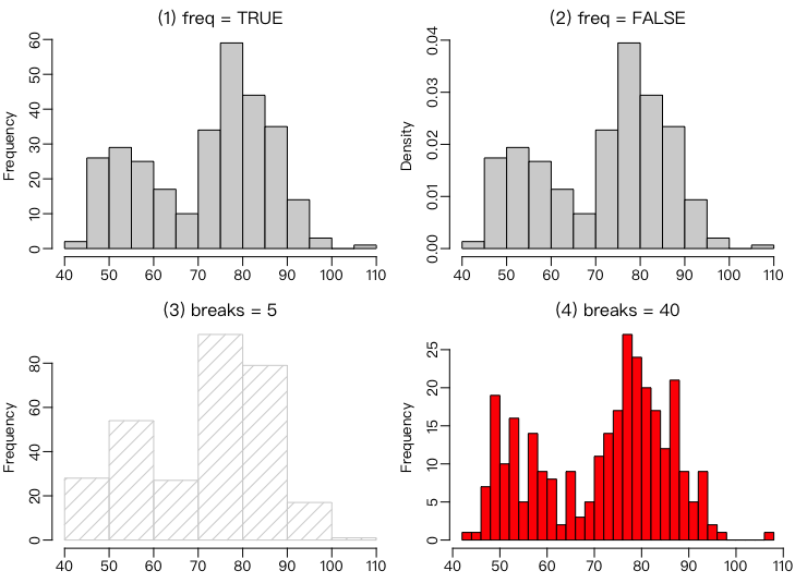 It reflects the division and the effect of frequency parameters.
base R
## 基础作图法绘制直方图与密度曲线的结合 par(mar = c(1.8, 3, 0.5, 0.1), mgp = c(2, 0.5, 0), mfrow = c(1, 2)) data(geyser, package = "MASS")hist(geyser$waiting, freq = FALSE, main = "") lines(density(geyser$waiting))
hst = hist(geyser$waiting, probability = TRUE, main = "", xlab = "waiting") d = density(geyser$waiting) polygon(c(min(d$x), d$x, max(d$x)), c(0, d$y, 0), col = "lightgray", border = NA) lines(d) ht = NULL brk = seq(40, 110, 5) for (i in brk) ht = c(ht, d$y[which.min(abs(d$x - i))]) segments(brk, 0, brk, ht, lty = 3)
ggplot
## ggplot2 绘制直方图与密度曲线的结合
library(ggplot2)
data(geyser, package = "MASS")
p = ggplot(aes(waiting), data = geyser) +
  labs(x = "间隔时间", y = "分布密度") +
  geom_histogram(breaks = seq(40, 110, by = 5), aes(y = ..density..))+
  geom_density(color = "blue", size = 1.2)
print(p)
On nuclear density estimates
The theory of nuclear density estimates is well developed today, and he's given a very good way of estimating the probability distribution of successive variables, and the other methods have completely lost their value.
- Yeah.
base RWe usedensity()Estimating nuclear density and mapping separately - Yeah.
ggplotWe offer the original method.
A composite nuclear density and histogram is the only solution to the probability distribution of successive variables today, and we also have a very sophisticated mapping tool for nuclear density at different factor levels.
Tube Chart
Now he's out of value.
Basic introduction
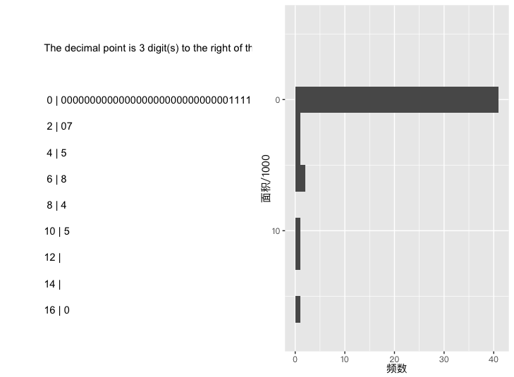
The function of the mid-R leaf map is stem()
- Parameters
scaleControls m, i.e. the length between sections (scaleThe larger the m, the smaller; widthControlled the width of the sprite, and if the length of the leaves exceeds that, the leaves will be intercepted to the length.width, and then a whole number of leaves left behind.xAlign with Histogram
Graphics Example
The distribution of land mass is severe right. Offset
Line Chart
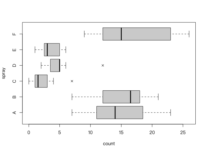
Box diagrams (Box Plot or Box-and-Whisker Plot) describe the distribution of data mainly from the angle of a four-point number; We can generally extrapolate the trend of data concentration or fragmentation (the shorter the length, the more dense the data are in the zone and the more thin the data are in the opposite).
Basic introduction
The corresponding function in R is boxplot()
boxplot() is a broad function, so it adapts to different parameter types. It currently supports two types of parameters: formulae. formula ) and data, which may be easier for us to understand (to give a set of data, to make the corresponding box diagrams), while the former generate multiple parallel box charts based on type variants, suitable for intuitive examination of the average values of groups
For the former, the parameters can be explained as follows:
- Parameters
xA numerical vector or a list, and if a list, make a box line in order for each sub-object in the list Figure rangeIt's an extension multiple that determines where the end (must) of the box chart extends, mainly for reasons of isolation, only from both ends of the box.$range\times Q_3-Q_1$ LocationwidthThe width of the given boxvarwidthis the logical value, ifTRUE, the width of the box is proportional to the square root of the sample, which is more useful when multiple batches of data are drawn together with multiple box lines, which further reflects the size of the sample.notchIt's also a useful logical parameter, which determines whether to draw a dent on the box, which is actually an estimate of a medium number. The rest of the questions we can refer to the help document, some parameters, for example.horizontalSimilar Parameter Set Horizontal Placement Problem
Graphics Example
base R
## 使用公式表示 data(InsectSprays) boxplot(count ~ spray, data = InsectSprays, col = "lightgray", horizontal = TRUE, pch = 4,varwidth = TRUE)使用传统的数据表示
x = rnorm(150) y = rnorm(50, 0.8) boxplot(list(x, y),names = c("x", "y"), horizontal = TRUE, col = 2:3, notch = TRUE, varwidth = TRUE)
ggplot
data(InsectSprays)
library(ggplot2)
p = ggplot(aes(y = count, x = spray), data = InsectSprays) +
  geom_boxplot(outlier.shape = 4) +
  labs(x = "杀虫剂", y = "频数") +
  coord_flip()
print(p)
Violin Chart
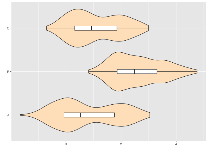
Violin Plot is a combination of density curves and box lines because its appearance is sometimes similar to the shape of the violin (especially when showing the density of double-peak data), so we call it the violin. Figure
Basic Introduction and Code
Case R doesn't support the drawing of violins, although there are lots of bags like lattice and vioplot The package is drawn, but given the consistency of the graphics, we give it here. ggplot2Example code
## ggplot2 绘制三组双峰数据的小提琴图比较
library(ggplot2)
f = function(mu1, mu2) c(rnorm(300, mu1, 0.5), rnorm(200, mu2, 0.5))
x1 = f(0, 2)
x2 = f(2, 3.5)
x3 = f(0.5, 2)
df = reshape(data.frame(A = x1, B = x2, C = x3),
              direction = "long", varying = c("A", "B", "C"),
              v.name=c("value"), times=c("A", "B", "C"))
p = ggplot(df, aes(value, time)) +
  geom_violin(fill = "bisque") +
  geom_boxplot(width = .1) +
  labs(x = "", y = "")
print(p)
Graphics Example
Axis of coordinates
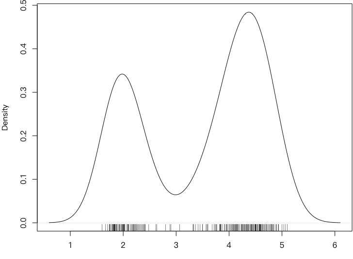
The coordinates must (Rug) is by definition the addition of short-shaves to the coordinates. The function of a truncheon is to indicate the exact location of the variable values on the respective axis, each of which corresponds to one data. The advantage of this is that we can see the distribution of the variable from the distribution of the axis.
The axis of the coordinates must be an attachment to a graphic (low-level graph function of Base R), but it is practical, so it is presented here separately.
Basic introduction
The function of the axis in the R is rug()
xFor a vector, give the short-shave position.ticksizeis the length of the short mustachesideThe location of the coordinates for the short-shu.
Graphics Example
base R
## 基础作图法绘制带坐标轴须的喷泉喷发时间密度曲线图
data(faithful)
par(mar = c(3, 4, 0.4, 0.1))
plot(density(faithful$eruptions), main = "")
rug(faithful$eruptions)
ggplot
## ggplot2 绘制带坐标轴须的喷泉喷发时间密度曲线图
library(ggplot2)
data(faithful)
p = ggplot(faithful, aes(eruptions)) + geom_line(stat = "density") +
  geom_rug() + xlim(c(1, 6)) + labs(x = "喷发时间", y = "分布密度")
print(p)
Belt Chart
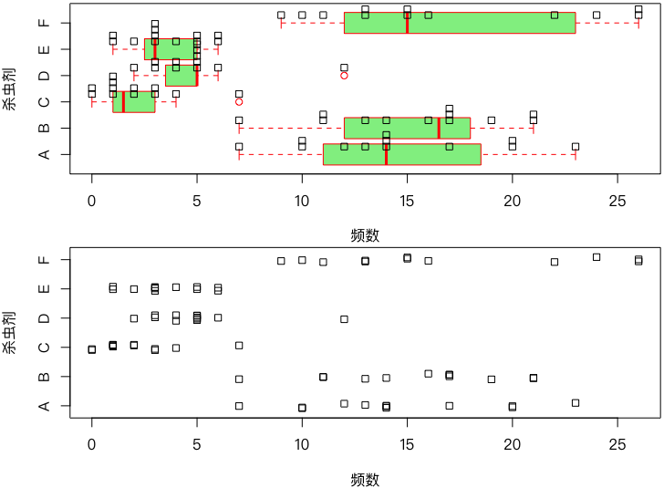
Strip Chart, also called 1-D Scatter Plot, is a scatterchart for one-dimensional data, which is essentially a scatterchart between the data and fixed values (fixed x or fixed y), resulting in a graphic appearance of a band, which is called a band Figure
Although he had the advantage of retaining raw data, he did use less.ggplot2No specific support
Basic introduction
The function of the band chart in R is stripchart() The belt chart function is a broad function, which directly accepts data parameters or formulae parameters.
xFor data, usually as a vectormethodSpecify the drawing method, take valuesoverplotIt means drawing all the data points on a straight line, whether or not they overlap.jitterIt means randomly shattering data on a straight line, so we don't know how many points we have at a particular location.stackIt means stacking up overlapping data, and the more data there is, the higher the pile.
Graphics Example
base R
## 基础作图法绘制各种杀虫剂下昆虫数目的带状图
data(InsectSprays)
layout(matrix(1:2, 2), height = c(1, 1))
par(mar = c(4, 4, 0.2, 0.2))
boxplot(count ~ spray, data = InsectSprays, horizontal = TRUE,
        border = "red", col = "lightgreen", at = 1:6 - 0.3,
        xlab = "频数", ylab = "杀虫剂")
stripchart(count ~ spray, data = InsectSprays, method = "stack",
           add = TRUE)
stripchart(count ~ spray, data = InsectSprays, method = "jitter",
           xlab = "频数", ylab = "杀虫剂")
Pie Chart
The pie map is currently used very widely, but according to the findings of statisticians (mainly Cleveland and McGill) and a number of psychologists (see below).Cleveland 1985) This statistical display of data in proportion is in fact a bad visualization, so it is clear from the Help Paper on Pie Charts that it is not recommended to use pie charts, but rather to use bar chartsBar ChartOr a dot.Cleveland PointAlternative
Although we do not recommend the use of pie charts, we still offer the means to use them.ggplot2 I don't want to offer a pie.
Basic introduction
R provides functions pie() Make pies.
- Parameters
xas a numerical vector (assured and equal to 1) labelsAs Tab- The other parameters are basically for polygons.
Specially, there's a three-dimensional picture of the experience that's worse than the flat pie.plotrix Package
Graphics Example
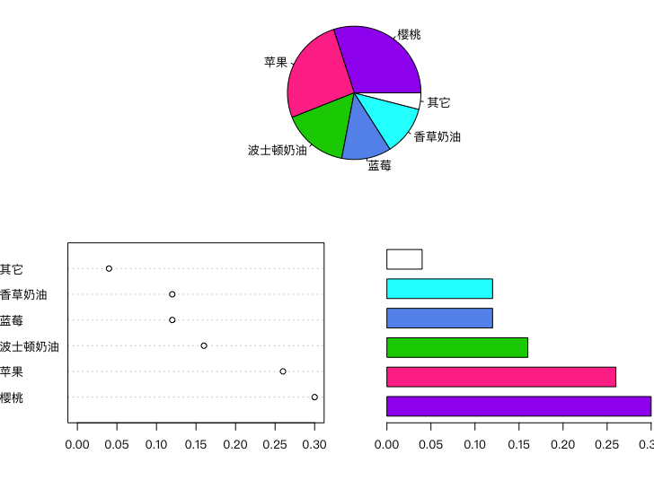
base R
## 基础作图法绘制馅饼销售饼图、点图和条形图
layout(matrix(c(1, 2, 1, 3), 2)) # 拆分作图区域
par(mar = c(4, 4, 0.2, 0.2))
pie.sales = c(0.12, 0.3, 0.26, 0.16, 0.04, 0.12)
names(pie.sales) = c("蓝莓", "樱桃", "苹果",
                     "波士顿奶油", "其它", "香草奶油")
pie.col = c("purple", "violetred1", "green3",
             "cornflowerblue", "cyan", "white")
pie.sales = sort(pie.sales, decreasing = TRUE) # 排序有助于可读性
pie(pie.sales, col = pie.col)
dotchart(pie.sales, xlim = c(0, 0.3))
barplot(pie.sales, col = pie.col, horiz = TRUE,
        names.arg = "", space = 0.5)
QQ Chart
There are many kinds of tests for statistical distribution, such as KS tests, calibration tests, etc., and from a graphic point of view, we can also use QQQ diagrams (Quantile-Quantile Plots) to check whether data are subject to a certain distribution; it is based on the theoretical distribution and the fraction of the actual distribution.
Basic introduction
The function of the QQQ figure in R is qqplot() , since normal distribution is the distribution that we've been checking so often, R also provides a function of drawing normal distribution of QQ Q diagrams qqnorm() , both functions are in the base pack stats Package
qqplot()The test is whether the distribution of the two batches is the same, so it takes two data parameters x and y (theoretical data are generated in functions, actually distributed given)qqnorm()Only one data parameter x (theoretically generated by normal distribution)
Graphics Example
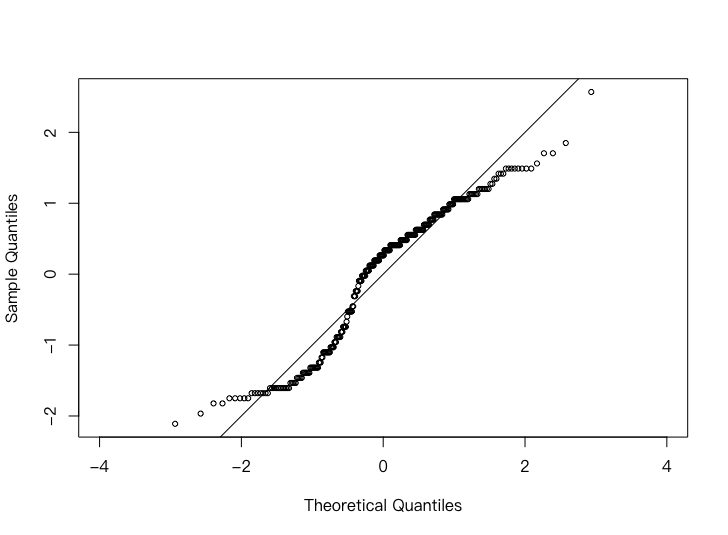
base R
## 基础作图法绘制喷泉间隔时间的正态分布 QQ 图
data(geyser, package = "MASS")
geyser$waiting_scaled = scale(geyser$waiting)
qqnorm(geyser$waiting_scaled, cex = 0.7, asp = 1, main = "")
abline(0, 1)
ggplot
## ggplot2 绘制喷泉间隔时间的正态分布 QQ 图
library(ggplot2)
library(qqplotr)
library(patchwork)
data(geyser, package = "MASS")
geyser$waiting_scaled = scale(geyser$waiting)
qq1 = ggplot(data = geyser, mapping = aes(sample = waiting_scaled)) +
  coord_fixed(ratio = 1, xlim = c(-3, 3), ylim = c(-3,3)) +
  geom_abline(aes(intercept = 0, slope = 1), color = "blue") +
  stat_qq_point() +
  labs(x = "理论分位数", y = "实际分位数")
qq2 = ggplot(aes(waiting_scaled), data = geyser) +
  geom_density() +
  stat_function(mapping = aes(x), data = data.frame(x = c(-3, 3)),
                fun = dnorm, n = 101, args = list(mean = 0, sd = 1),
                linetype = 2) +
  labs(x = "间隔时间(标准化)", y = "分布密度")
print(qq1 | qq2)
Waterfall Chart
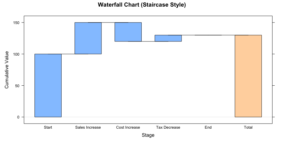
Waterfall Plot is a visualized chart often used to demonstrate trends in data, especially for cumulative changes over different time periods or stages. It usually consists of a series of adjacent bar or column charts, each of which represents the increase or decrease in a given variable. The most common areas of application for waterfall maps include financial analysis, analysis of sales data, demonstration of experimental results, etc.
He's a variant of the traditional strip.
library(waterfall) library(dplyr)创建原始数据
a <- c("Start", "Sales Increase", "Cost Increase", "Tax Decrease", "End") data <- data.frame( Stage = factor(a,ordered = T,levels = a), Change = c(100, 50, -30, 10, 0) # End值设置为0,确保它出现在最后 )
使用 waterfallchart 绘制瀑布图
waterfallchart(data = data, Change~Stage, main = "Waterfall Chart (Staircase Style)", ylab = "Cumulative Value", xlab = "Stage")
The format is as follows:
Double Variable Chart
This chapter presents statistical graphics reflecting the random relationship between the two variables;
One of the most classic is a scatterchart describing the continuity between two consecutive variables.
If one of the two variables is a qualitative one, it is consistent with our thinking of comparing the graphics of multiple single variables, such as the bar chart, the box line, the point figure in the previous chapter.
As for the issue of matrix graphics and multiple variables larger than two, we'll look at it separately later. Multivariate Chart Matrix Graphics
Scatter Chart
The scatterchart is usually used to show the relationship between the two variables, which may be linear or non-linear, and the vertical and vertical coordinates of each point in the map correspond to the observations of each of the two variables, so that the trend reflected by the breakpoint is the relationship between the two variables.
We don't have any extra information.
Graphics Example
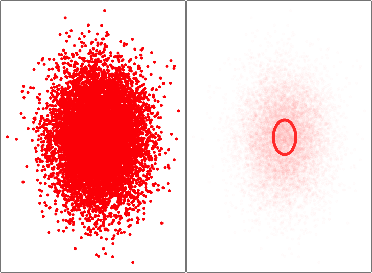 The right-hand map adjusts the transparency design to create a highly superheavy circle that is useful for high density situations, and, of course, we also have some other means of dealing with the problem of high density fragmentation overlaps, for example. graphics Medium
 smoothScatter The nuclear density in it is smooth. It's a very worthwhile solution, reference.Smooth Scatter Point Chart
base R
## 基础作图法绘制半透明散点图中
data(BinormCircle, package = "MSG")
par(mfrow = c(1, 2), pch = 20, ann = FALSE, mar = rep(.05, 4))
plot(BinormCircle, col = rgb(1, 0, 0), axes = FALSE)
box()
plot(BinormCircle, col = rgb(1, 0, 0, alpha = .01), axes = FALSE)
box()
ggplot
## ggplot2 绘制半透明散点图中
data(BinormCircle, package = "MSG")
library(ggplot2)
library(patchwork)
p = ggplot(BinormCircle, aes(V1, V2)) +
  theme(axis.ticks = element_blank(), axis.text = element_blank(),
        axis.title = element_blank())
p1 = p + geom_point(color = rgb(1,0,0)) + theme_void()
p2 = p + geom_point(color = rgb(1,0,0), alpha = 0.01) + theme_void()
print(p1 | p2)
A one-digit function curve
We're going to tell you how to draw a one-dimensional curve, and only one-dimensional functions can be shown better on the two-dimensional plane.
This curve is not too deep for data analysis, so...ggplot2No method of drawing available
Basic introduction
The function of the function curve in R is curve() R provides a function specifically designed to save us from the use of lower layers for mapping functions (e.g. lines()The energy and the time.
- Parameters
expr(a) for a single function or the name of that function; fromandtoThe starting point and end point of the curve are defined separately;nDetermines how many sub-areas the defined domain is divided to calculate the function and connect the curve,nThe larger the value, the smoother the curve.
Graphics Example
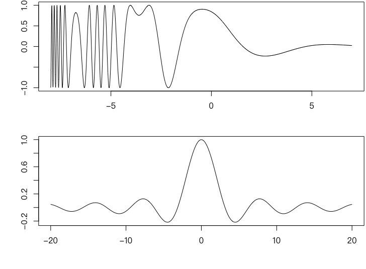
base R
## 基础作图法绘制一元函数曲线图
par(par(mar = c(4.5, 4, 0.2, 0.2)), mfrow = c(2, 1))
chippy = function(x) sin(cos(x) * exp(-x / 2))
curve(chippy, -8, 7, n = 2008, xlab = "x", ylab = "chippy(x)")
curve(sin(x) / x, from = -20, to = 20, n = 200,
      xlab = "t", ylab = expression(phi*X(t)))
Sunflower Scatter
The SunFlower Scatter Plot is a special scattering tool for overcoming the overlap of data points in the scatter. It uses the method of using the number of petals of a `sunflower' to indicate the number of overlapping data where there are overlaps, so that we can easily see where the data in the scattered maps overlap and know the exact number of overlaps.
Scattered sunflower maps are useful when data are particularly dense or the type of data is classified, since in both cases it is easy to generate duplicate data points
ggplot2It doesn't provide the method of drawing.
Basic introduction
The function of the Sunflower graph in R is sunflowerplot()
xandyTwo variables, respectively, for the dispersion map;numberNumber of data frequencies to be given manually, i.e., the number of petals in the chart, if this parameter is not specified, R automatically fromxandyCalculation;-
rotateWhether to rotate the angle of sunflower at random; pchType of point given in the dispersed map;cex(a) The number of times the point of a scattered map is scaled;cex.factMultiplier reduction of the center point of the directed sunflower. The real scaling factor iscex/cex.fact;
Graphics Example
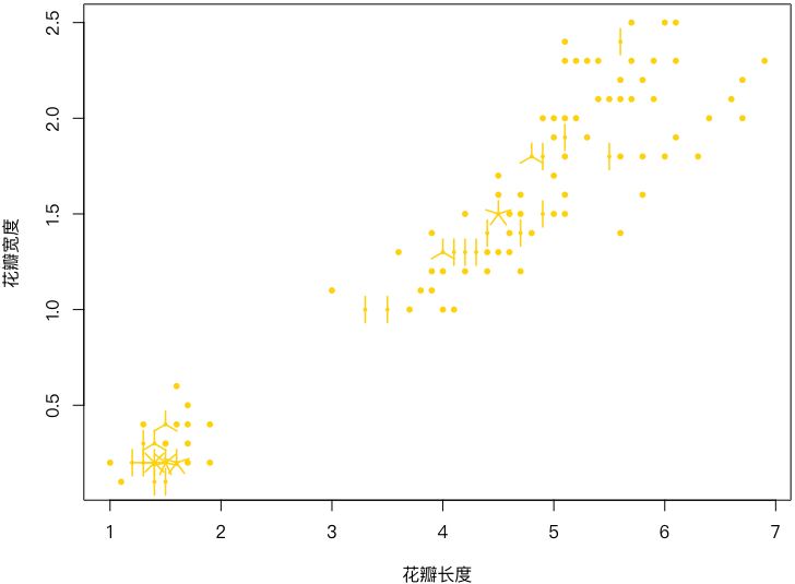
base R
## 绘制鸢尾花花瓣长和宽的向日葵散点图
data(iris)
par(mar = c(4, 4, 0.2, 0.2))
sunflowerplot(iris[, 3:4], col = "gold", seg.col = "gold",
              xlab = "花瓣长度", ylab = "花瓣宽度")
Smooth Scatter Point Chart
The smooth-scatter map is based on a disassembly map, but it is not based directly on a 2-D nuclear density estimate, but rather on a specific colour indicating the density value of a position at a shallow level, the deeper the default colour, the greater the 2-D density value, the more dense the data point.
The relationship between the two variables can still be seen in the map, as the smooth break-point map roughly retains the location of the original data point, which is similar to the normal break-point map. The further advantage of smooth-spreading is that it also shows the density of the two-dimensional variable, from which we may be able to observe local cluster phenomena (dark mass).
Smooth dispersing dots look like peace.Scatter ChartThe right figure is similar, but the former contains more mathematical statistical background. However, we do not have to pursue mathematical theory at all, and why is it not a density estimate that is reflected in the nature of transparency?
Basic introduction
The function of a smooth dispersing pointchart in R is smoothScatter()
-
xandyis a two-value vector or if not providedycan provide a two-column matrix/data box, etc. Here.x; nbin(a) the number of grids assigned to the vertical and vertical coordinates, which may be an integer vector of 1 or 2 length;bandwidthThe bandwidth used to calculate nuclear density estimates;colrampThe default generation of colour vectors from white to blue gradients for the function of generating colour vectors;nrpointsFor the number of points that need to be drawn, because the smooth dispersed dots are not meant to draw the dots but the colours, but sometimes the density estimates are very low in some parts of the picture, so the corresponding colours are very shallow, making it difficult for the reader to detect the presence of data points in those places, and it would be useful to draw them directly.
Graphics Example
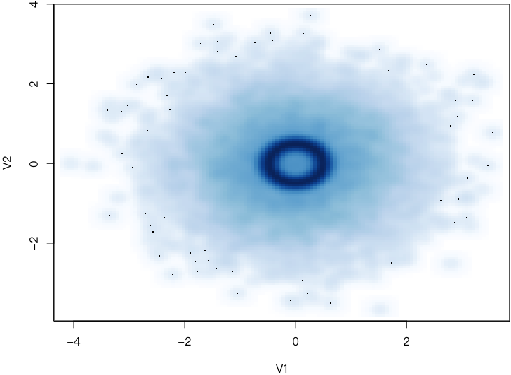
base R
## 基础作图法绘制 BinormCircle 数据的平滑散点图
data("BinormCircle", package = "MSG")
par(mar = c(4, 4, 0.3, 0.1))
smoothScatter(BinormCircle)
ggpot
## ggplot2 绘制 BinormCircle 数据的平滑散点图
data("BinormCircle", package = "MSG")
library(ggplot2)
library(ggpointdensity)
p = ggplot(data = BinormCircle, aes(x = V1, y = V2)) +
  geom_pointdensity(adjust = 0.1) +
  scale_color_gradient(low="lightblue", high="darkblue") +
  theme(legend.position = "")
print(p)
Wind Rose Map
The wind roses are a very special kind of graphics, including wind to roses and wind speed roses; it's just that we use the latter to show wind speed and direction.
It's only for wind speed and direction, it's for the weather, and it's only because it's used occasionally.
The wind roses are essentially stacked strips drawn in a polar system, usually divided into 16 sectors; each sector is the frequency of wind speeds in the direction of the wind.beside = F Bar Drawing
Basic introduction
In R openair Package provides function windRose The drawing is done using the following:
mydataData frame for recording wind direction and speedwsWind Quick Row NamewdWindward column nameangelWind-direction angle More needs we can look at.
Graphics Example
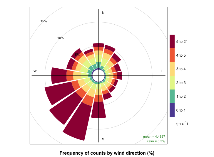
Openair Code Achieved
## 绘制风玫瑰图
library(openair)
windRose(mydata)
windRose(mydata = mydata, ws = "ws", wd = "wd",
         key.position = "right", paddle = FALSE, seg = 0.9,
         angle = 22.5, ws.int = 0.5,
         cex = 3, breaks = c(seq(0,5,1), 21))
Survival Function Chart
In many medical studies, our main concern is the timing of a patient's event, such as death, relapse. In fact, the area of “lifetime” as the object of research is not limited to medicine, for example, in the area of finance, where we may need to know when credit risk occurs for credit card holders. This type of data is generally referred to as survival data, which is usually characterized by the omission of the object from our observations for some reason.
Such research, referred to separately as survival analysis, is a very important category of issues, with specific realizations.
Basic introduction
The graphic object to be presented in this section is primarily a survival function, defined as the individual ' s survival beyond time. $t$ Probability $S(t)=P(T)>t); t\geq$0 For the existence of missing survival data $(t_i,\delta_i),i=1,\cdots,n$ of which $t_i$ For recording time,$\delta_i=0$ An estimated Kaplan-Meier for the survival function is:
$$ \left.\hat{S}(t)=\left{\begin{array}{ll}\prod_{i\colon t_{(i)}\leq t}(\frac{n-i}{n-i+1})^{\delta_{(i)}},&\\text{t\leqt (n)};\0&\\text{if}\delta (n)}=1,\text{undefined}&\\text{(n)=,\end{array}\right.\right.\text{t){>t_{(n)}. $$
survival The package provides the method of calculating and estimating the survival function. The function is survfit(), it returns a survfit class object; And... survival The package expands the generic function plot()to have sub-functions plot.survfit(), so after estimating the survival function, we can call directly. plot() Generate survival function maps
Graphics Example
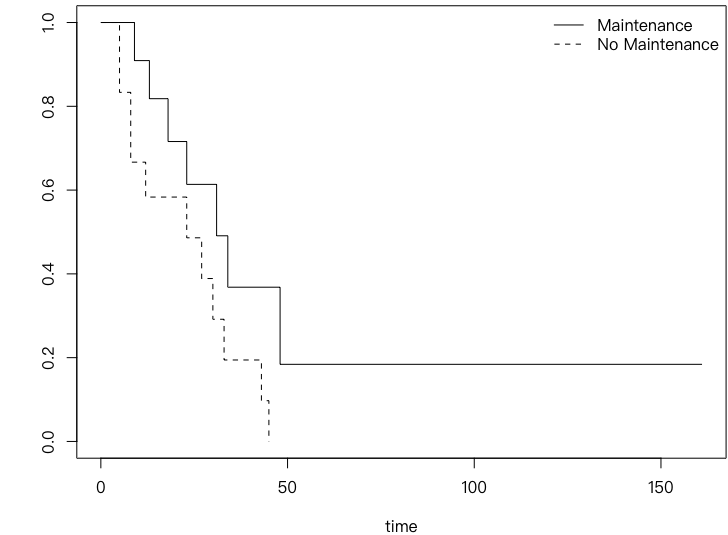
Survival code achieved
data("leukemia", package = "survival")
library(survival)
leukemia.surv = survfit(Surv(time, status) ~ x, data = aml)
plot(leukemia.surv, lty = 1:2, xlab = "time")
legend("topright", c("Maintenance", "No Maintenance"),
       lty = 1:2, bty = "n")
Conditional Density Chart
Conditional Density Chart (Conditions Density Plot), which by definition shows the condition density of a variable, a classification variable$Y$Relative to a continuous variable$X$ Conditional density $P(Y|X)$I don't know. Assumptions $Y$ The value to be taken is $1,2,\cdots,k$, then the condition density map will be by$X$ The extraction values are displayed in descending directions from small to large. Out$Y=i\left(i=1,2,\cdots,k\right)$ Rate of probability distribution of conditions
Basic introduction
The function of the condition density diagram in R is cdplot(), it's based mainly on density functions density() Completion of condition density calculation
-
xFor the conditional variable X, it's a numerical vector,yis a factor vector, the discrete variable Y; he is also a generic function plotDetermines whether graphics are made for logical values (or only calculated without drawing)
We could use it to study what was supposed to be used.logit The question of re-entry is a reference for a supervisor.
Graphics Example
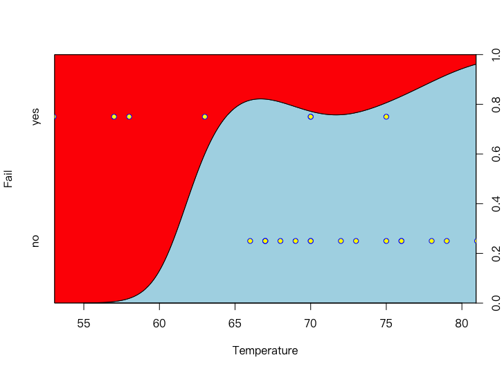
base R
## 基础作图法绘制航天飞机 O 型环在不同温度下失效的条件密度图
data(orings, package = "DAAG")
orings$Fail = factor(apply(orings[, -1], 1, function(x) all(x == 0)),
                     labels = c("yes", "no"))
cdplot(Fail ~ Temperature, data = orings, col = c("lightblue", "red"))
points(orings$Temperature, c(0.75, 0.25)[as.integer(orings$Fail)],
       col = "blue", bg = "yellow", pch = 21)
ggplot
## ggplot2 绘制航天飞机 O 型环在不同温度下失效的条件密度图
library(ggplot2)
library(DAAG)
data(orings, package = "DAAG")
orings$Fail = factor(apply(orings[, -1], 1, function(x) all(x == 0)),
                     labels = c("yes", "no"))
p = ggplot(orings,
           aes(Temperature, ..count.., fill = Fail)) +
  geom_density(position = "fill") +
  geom_point(aes(Temperature, c(0.75, 0.25)[as.integer(Fail)])) +
  xlab("温度") +
  scale_y_continuous("失效", breaks = c(0.25, 0.75),
                     labels = c("否", "是")) +
  theme(legend.position = "")
print(p)
2-D box line
We've got a regular box chart.Line Chart, i.e., the fractions of one-dimensional data are expressed in a box line, and in a two-dimensional scenario we can draw a two-dimensional chart of the box with similar ideas. Two-dimensional graphs, also known as Bag Plot
The approach of the 2-dimensional graph is to move out of the centre of the data and gradually wrap up points in the scattered maps in a condensed polygon until they reach half the data points, when the condensation is equivalent to boxes in the ordinary graphs and then outsourced to all data points. The basic composition of the two-dimensional diagram is a centre and two polygons, which provide a rough description of the two-dimensional distribution of data.
A 2-D box line also needs a special kit to do it.
Basic introduction
Center R aplpack The package provides a function bagplot() It can be used to draw two-dimensional graphs.
xandyA data vector on a vertical axis, or a matrix or data frame for two columns, directly;factorSimilarboxplot()MediumrangeParameters, which define the distance from the group point and the larger the value, the smaller the number of points away (the distance from the centre of the data point);approx.limitSample quantities of large data are defined and randomly extracted if sample quantities of original data exceed this numberapprox.limitA data point is used for the calculation of a two-dimensional chart;dkmethodTake values 1 or 2, determine which method to calculate the scope of the bag, take values 2 more precisely
Special
msg("5.9) #出现报错
Multivariate Chart
Start with this chapter with three and more variables; but we leave a special graphic: the matrix graphic to the next chapter.
Spreadchart Matrix
Scatterplot Matrices is a high-dimensional extension of the scatterchart, which basically consists of a normal breakchart, and which simply sets out the two-diggles of multiple variables in a matrix form, constituting the so-called breakchart matrix.
The scatterchart matrix has, to some extent, overcome the difficulty of displaying high-dimensional data on the plane, which is very useful in looking at the two relationships between variables.
Basic introduction
The function of the stand-down matrix for R is pairs()
-
xIt's a matrix or data box that contains the variables that are to be used to make a scatter map. panelParameters give a function to draw a scatterchart, which is applied to each cell;- Sometimes we don't need a uniform scattering function.
lower.panelandupper.panelto specify graph functions in the upper and lower triangles, respectively
carPackagescatterplotMatrix()function can also generate a scatterchart matrix with a higher degree of customisation
Graphics Example
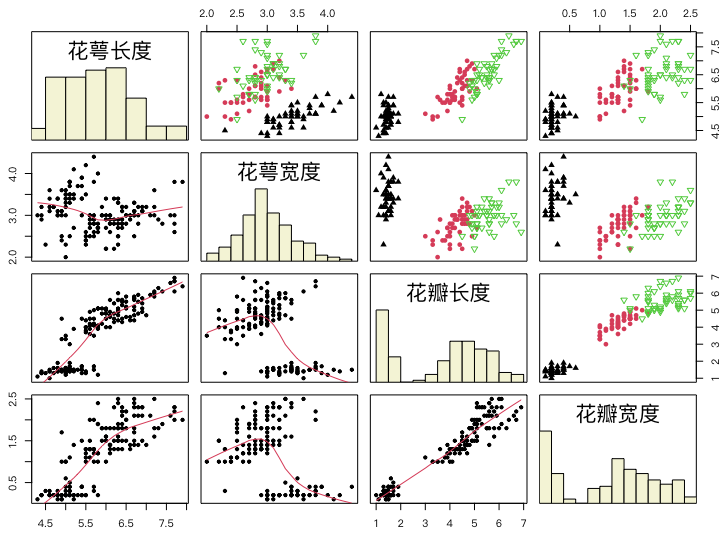
base R
## 基础函数作图法绘制鸢尾花数据的散点图矩阵
## 观察如何使用 hist() 做计算并用 rect() 画图
data("iris")
panel.hist = function(x, ...) {
  usr = par("usr")
  on.exit(par(usr))
  par(usr = c(usr[1:2], 0, 1.5))
  h = hist(x, plot = FALSE)
  breaks = h$breaks
  nB = length(breaks)
  y = h$counts / max(h$counts)
  rect(breaks[-nB], 0, breaks[-1], y, col = "beige")
}
idx = as.integer(iris[["Species"]])
names(iris)[1:4] = c("花萼长度", "花萼宽度", "花瓣长度", "花瓣宽度")
pairs(iris[1:4],
      upper.panel = function(x, y, ...)
        points(x, y, pch = c(17, 16, 6)[idx], col = idx),
      pch = 20, oma = c(2, 2, 2, 2),
      lower.panel = panel.smooth, diag.panel = panel.hist
)
ggplot
We add new packages to achieve better results.
## ggplot2 绘制鸢尾花数据的散点图矩阵
library(ggplot2)
library(GGally)
data("iris")
names(iris) = c("花萼长度", "花萼宽度", "花瓣长度", "花瓣宽度", "种类")
p = ggpairs(iris, aes_string(colour="种类", alpha=0.5))
print(p)
Conditional Partition Chart
The idea of the partitioning of conditions (Conditioning Plot) stems from the distribution of conditions in statistics, i.e. the distribution of variables of interest to us after a given variable (or variables) has been given. This “distribution” refers mainly to the relationship between the two variables in the condition partition figure, which is usually expressed as a scattered figure.
The partitioning of conditions can be seen as a further in-depth discovery of the dispersion map, which can be divided into all data with one or two condition variables, which, on the edge of the graphic, mark the range of values of the variable in a grey rectangular bar, each of which corresponds to a scattering chart (which should, strictly speaking, be referred to as the “conditional break-up chart”), which is the basic approach.
Basic introduction
The function of the condition partition in R is coplot()
- Parameters
formulaA formula in the form ofy ~ x | a(a condition variable) ory ~ x | a * b(two condition variables), "|is followed by the condition variable; dataFor data, it containsx、y、aandbVariables;given.valuesSpecify the range of values for the condition variable;panelParameters are the key parameters of this function, which determines the pattern of each scattered map, and the default is only a dotnumberandoverlapPass.co.intervals()The function is used to calculate the number of partitions that divide the continuous variable, which sets the overlap ratio between the compartments. The continuous variable divide refers to how we divide the condition variable, because the scatterchart is limited and the number of compartments needs to be compared to the number of maps Match
Graphic Examples
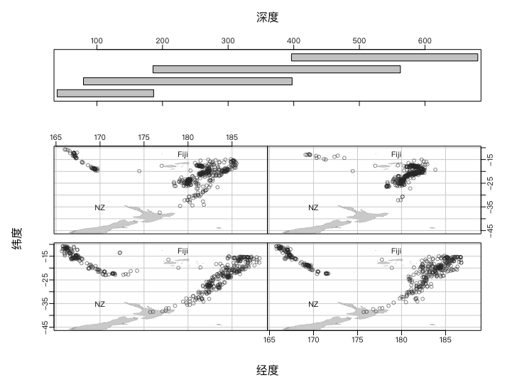
base R
## 基础作图法绘制给定震源深图的地震经纬度条件分割图
data(quakes)
library(maps)
par(mar = rep(0, 4), mgp = c(2, .5, 0))
coplot(lat ~ long | depth, data = quakes, number = 4,
       xlab = c("经度", "深度"), ylab = "纬度",
       ylim = c(-45, -10.72), panel = function(x, y, ...) {
         map("world2",
             regions = c("New Zealand", "Fiji"),
             add = TRUE, lwd = 0.1, fill = TRUE, col = "lightgray"
         )
         text(180, -13, "Fiji", adj = 1)
         text(170, -35, "NZ")
         points(x, y, col = rgb(0.2, 0.2, 0.2, .5))
       }
)
Symbolic Chart
The symbol chart is a graphic tool for displaying high-dimensional data with symbols, and its main idea is to give high-dimensional values to the character of the symbol in the graphic.
The symbol chart is in essence a highly customised scattered map more than the previous settingspanelMore defined parameters
For example, using a rectangle as the basic symbol of the scattering map, we can use its width to represent two variables, so that at least four variables can be placed in a graphic, and we can achieve a high-dimensional presentation.
It takes us to think carefully.
Basic introduction
The symbol chart function in R is symbols(), it provides six basic symbols: round, square, rectangular, star, thermometer and box line charts, specified by respective parameters
circlesCircle: a numerical vector, radius of given circlesquaresSquare: a numerical vector, to the side of a square Longrectanglesrectangular: a matrix, with two columns, each giving the width of the rectangular and HighstarsStar: a matrix, columns 3 and a radar-like map of the length of the ray from the center of the star to each direction (stellar segment strictly speaking) (stellar shape is not intuitive in the symbol chart, direct astrograph is recommended)thermometersThermometers: a matrix with 3 or 4 columns, the width and height of the thermometers for each of the first two columns; if the matrix is 3 columns, then the “temperature” height of the third column included in the thermometer should be smaller than 1, otherwise the temperature filling would exceed the thermometer range; if the matrix was 4 columns, the temperature would be filled at the ratio of the third column to the fourth column; similarly, the ratio of the two columns would need to be less than 1boxplotsA matrix with a number of 5 columns, the width and height of each of the first two columns, the length of the third and fourth columns, respectively, of two lines (downline and upline), similar to the thermometer in the fifth column, and the proportion of the median marking line within the given box chart to the height of the inner section of the box, so the data for this column is also required $[0,1]$ Range; here's just the name of the box chart, which has nothing to do with the actual box chart.
Graphics Example
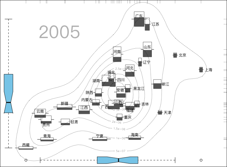
It is based on a map of equal heights, using the variables of life expectancy and the number of highly educated people to calculate the two-dimensional density and draw the same line, thus completing the bottom map;
We then add the thermometer symbol to the map using the values of both the life expectancy of the population and the number of highly educated persons. The thermometer width represents the growth rate, the number of the population is high and the temperature represents the proportion of the urban population;
Then we'll use it. text() function.
The five demographic characteristics of the autonomous regions of the provinces and municipalities of the country, as expressed by these graphic elements, are evident, for example, in the height of thermometers, which show that the three population departments, Guangdong, Shandong and Henan (the corresponding small areas of the population, such as Tibet, Qinghai and Ningxia, etc.), show a very high rate of natural population growth in the autonomous regions of Tibet, Qinghai, Ningxia and Xinjiang (while the rate of growth in directly administered municipalities such as Beijing, Shanghai and Tianjin is very low), and that, according to temperature indicators, the proportion of the population living in the cities directly under the Beijing, Shanghai and Tianjin municipalities is much higher than in other regions;
Based on the overall scattered figure, the average life expectancy of the population is relatively positive in relation to the number of persons with higher education. An average life expectancy of the population and the distribution of the number of highly educated persons respectively are to be depicted in the diagrams and coordinates. So we've done the task of describing five-dimensional variables on the plane.
base R
## 以下是生成图形的代码:
ChinaPop =
structure(c(1.09, 1.43, 6.09, 6.02, 4.62, 0.97, 2.57, 2.67, 0.96,
2.21, 5.02, 6.2, 5.98, 7.83, 5.83, 5.25, 3.05, 5.15, 7.02, 8.16,
8.93, 3, 2.9, 7.38, 7.97, 10.79, 4.01, 6.02, 9.49, 10.98, 11.38,
1538, 1043, 6851, 3355, 2386, 4221, 2716, 3820, 1778, 7475, 4898,
6120, 3535, 4311, 9248, 9380, 5710, 6326, 9194, 4660, 828, 2798,
8212, 3730, 4450, 277, 3720, 2594, 543, 596, 2010, 0.8362, 0.7511,
0.3769, 0.4211, 0.472, 0.587, 0.5252, 0.531, 0.8909, 0.5011,
0.5602, 0.355, 0.473, 0.37, 0.45, 0.3065, 0.432, 0.37, 0.6068,
0.3362, 0.452, 0.452, 0.33, 0.2687, 0.295, 0.2665, 0.3723, 0.3002,
0.3925, 0.4228, 0.3715, 76.1, 74.91, 72.54, 71.65, 69.87, 73.34,
73.1, 72.37, 78.14, 73.91, 74.7, 71.85, 72.55, 68.95, 73.92,
71.54, 71.08, 70.66, 73.27, 71.29, 72.92, 71.73, 71.2, 65.96,
65.49, 64.37, 70.07, 67.47, 66.03, 70.17, 67.41, 48001, 18601,
40036, 23197, 23660, 44404, 22832, 30888, 40549, 63909, 33115,
29007, 21877, 19946, 50909, 48450, 36287, 34917, 66510, 22556,
5524, 16122, 35297, 14897, 18117, 293, 28734, 13637, 4682, 4895,
21340), .Dim = c(31L, 5L), .Dimnames = list(c("北京", "天津",
"河北", "山西", "内蒙古", "辽宁", "吉林", "黑龙江", "上海", "江苏",
"浙江", "安徽", "福建", "江西", "山东", "河南", "湖北", "湖南",
"广东", "广西", "海南", "重庆", "四川", "贵州", "云南", "西藏",
"陕西", "甘肃", "青海", "宁夏", "新疆"), c("增长率", "总人口",
"城镇人口比重", "预期寿命", "高学历人数")), adj = structure(c(-0.5,
-0.5, 0.5, 0.5, 1.3, -0.4, -0.6, -0.5, -0.5, -0.6, -0.6, 0.6,
0.5, 0.5, 0.5, 0.5, 0.5, 1.8, 0.5, 1.7, 0.5, -0.6, -0.6, 0.5,
0.5, 0.5, 1.7, -0.7, 0.5, 0.5, 0.5, 0.5, 0.5, -0.5, 0, -0.5,
0.5, 0.5, 0.5, 0.5, 0.5, 0.5, -0.3, 2.1, -0.3, -0.5, -0.5, -1.6,
0.5, -0.7, 1.3, -0.7, 0.5, 0.5, 2.4, -0.3, -0.6, 0.5, 0.5, -0.8,
-0.7, -0.8), .Dim = c(31L, 2L), .Dimnames = list(c("北京", "天津",
"河北", "山西", "内蒙古", "辽宁", "吉林", "黑龙江", "上海", "江苏",
"浙江", "安徽", "福建", "江西", "山东", "河南", "湖北", "湖南",
"广东", "广西", "海南", "重庆", "四川", "贵州", "云南", "西藏",
"陕西", "甘肃", "青海", "宁夏", "新疆"), c("horizontal", "vertical"
))))
library(KernSmooth)
x = ChinaPop
x[, 1:2] = apply(x[, 1:2], 2, function(z) 20 * (z -
    min(z)) / (max(z) - min(z)) + 5)
symbols(x[, 4], x[, 5],
  thermometers = x[, 1:3], fg = "gray40",
  inches = 0.5, xlab = "\u4EBA\u5747\u9884\u671F\u5BFF\u547D", ylab = "\u9AD8\u5B66\u5386\u8005\u4EBA\u6570"
)
est = bkde2D(x[, 4:5], apply(x[, 4:5], 2, dpik))
contour(est$x1, est$x2, est$fhat, add = TRUE, lty = "12")
for (i in 1:nrow(x)) {
  text(x[i, 4], x[i, 5], rownames(x)[i],
    cex = 0.75, adj = attr(x, "adj")[i, ]
  )
}
rug(x[, 4], 0.02, side = 3, col = "gray40")
rug(x[, 5], 0.02, side = 4, col = "gray40")
boxplot(x[, 4],
  horizontal = TRUE, pars = list(
    boxwex = 7000,
    staplewex = 0.8, outwex = 0.8
  ), at = -6000, add = TRUE, notch = TRUE, col = "skyblue",
  xaxt = "n"
)
boxplot(x[, 5],
  at = 63, pars = list(
    boxwex = 1.4,
    staplewex = 0.8, outwex = 0.8
  ), add = TRUE, notch = TRUE, col = "skyblue",
  yaxt = "n"
)
text(67, 60000, "2005", cex = 3.5, col = "gray")
Star Chart
Star Plot, Spider Plot and Radar Plot are essentially graphics, all of which represent the size of the variable by the length of the line from the center, and the difference between these three graphic names is that the star chart is used to show many multivariant individuals, each individual is independent of each other, so the whole picture looks like a lot of stars. Star
Cobweb and radar maps place multiple variable individuals on the same graphic, which looks like the shape of a spider web or radar, so the overlapping graphic is called a spider map or radar map. In short, there are several centres in the asterisk map, and only one centre in the spider and radar maps.
Base R is enough.
Basic introduction
The function of the star chart in R is stars()
- Parameters
xFor a multi-dimensional data matrix or data frame, each line will generate a star shape; fullThe use of round (or half circle) is determined for logical values;scaleWhether or not to standardize the data into a zone $[0,1]$ Inside;radiusWhether or not to draw a radius;labelsFor the name of each individual, the default is the line name of the data;locationsIn a two-column rectangle, give the position of each star, and by default place it on a rule rectangle grid. If the parameter is provided with a vector of 2 length, all stars will be placed on the coordinates, thus forming a spider map or radar map;
Graphics Example
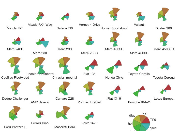
base R
## 绘制汽车数据的星状图
## 预设调色板,stars() 默认用整数来表示颜色
palette(rainbow(12, s = 0.6, v = 0.75))
stars(mtcars[, 1:7], len = 0.8, key.loc = c(14, 1.5), ncol = 7,
      main = "", draw.segments = TRUE)
palette("default") # 恢复默认调色板
Face map
The Facebook map, presented by Chernoff, presents multiple data in a very interesting way: There are many features to a person's face, such as eye size, eyebrow radians, face width and nostrils, which can be measured in numerical sizes, so we can also reciprocate a set of values to these faces.
TeachingDemos The package provides two Facebook functions faces() and faces2() , the two functions reflect different facial features, each of which has merit, e.g. faces() You can draw hair and ears, but... faces2() You can draw more variables. We only introduce the latter.
Among the many statistical graphics, Facebook can be one of the most humorous, and readers may try to use it at some easy times or when the audience is not focused, perhaps to give the audience a sense of light and a proactive reading of the data in the map.
Basic introduction
faces2() The function is what we need to study most.
matIt is the main parameter, it is a data matrix, each line corresponds to a face and the characteristics of each part of the face correspond to the column in the matrix;whichIt is also an important parameter used to specify which facial characteristics each column in the data matrix corresponds to, and it is an integer vector with values ranging from 1 to 18 for each element of the vector
Graphics Example
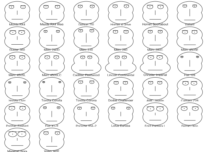
face2
## 绘制部分汽车数据的脸谱图
library(TeachingDemos)
faces2(mtcars[, c("hp", "disp", "mpg", "qsec", "wt")],
       which = c(14, 9, 11, 6, 5))
Three-dollar figure
The three-dollar map is a very special statistical graphic that can only process data of 3 columns and 1 or 100 for each row; they are often chemical composition data, such as the percentage of three components of a mixture. That's right.
For the three-dollar map, we need a package. vcd Perform drawing
Specific Function Introduction Available Help
Graphics Example
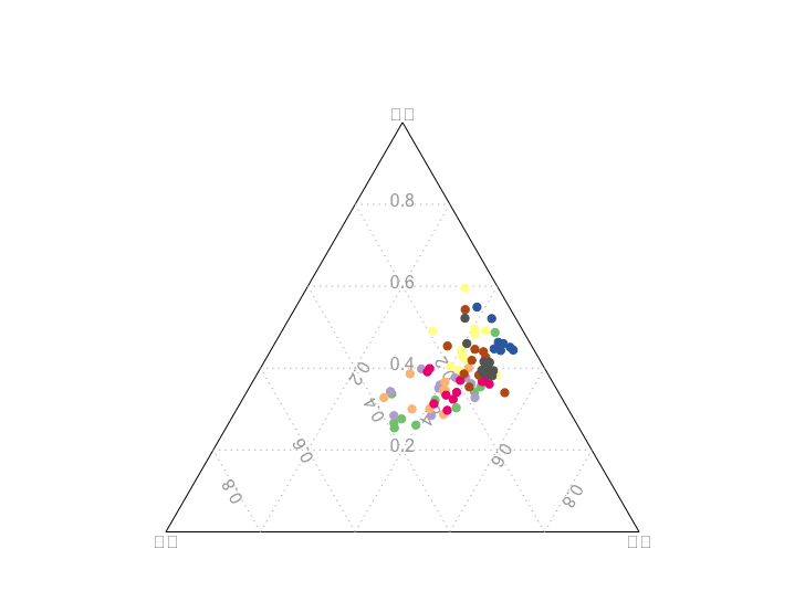
vcd
## 绘制土壤样本三元图
data(murcia, package = "MSG")
library(vcd)
ternaryplot(murcia[, 2:4], main = "",
            dimnames = c("砂粒", "粉粒", "黏粒"),
            col = MSG::vec2col(murcia$site), cex = .5)
Marcello.
Mosaic Plots is a tool for displaying multiple statistical analysis of the multi-dimensional tables: the data of the arrays that do not limit the dimensions of the arrays, unlike the association and the quadratic charts, which are limited to low-dimensional arrays.
Masektu is expressed as a rectangle in proportion to the frequency, and the whole picture looks like a few Marseks on the plane. The statistical theory behind Masektu is a linear model (log-linear model)
Basic introduction
The function of R-Massektu is mosaicplot()
xData for a column (may be used for functions)table()Generating);main、sub、xlabandylabSets the main title, the subheading and the coordinates heading, respectively;-
sortSpecifies the order in which the variables are displayed; dir(b) Specifying the direction of splits (horizontal splits or vertical splits) in Masaketu;typeType of disability given
Graphics Example
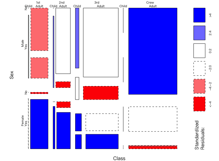
base R
## 绘制泰坦尼克号生还数据的马赛克图
data(Titanic)
par(mar = c(2, 3.5, .1, .1))
mosaicplot(Titanic, shade = TRUE, main = "")
Effort of factors
Whether there are significant differences in the average variable values of the multi-group differential analysis study
The factor effect map can be seen as a weak and widespread problem of differential analysis, and we can make more statistics than just averages, but we've lost the statistical test, and we've only had exploratory analytical effects, and occasionally it's working, because we can choose some more robust methods.
The problem of differential analysis in mapping the effects of similar factors
Basic introduction
The function of the factor effect chart in R is plot.design()
xFor the data box containing the self-variant (classification variable), it may also contain the cause variable, in which case the second parameter need not be provided;yFor variables;funThe function for which the variable level is calculated;
Graphics Example
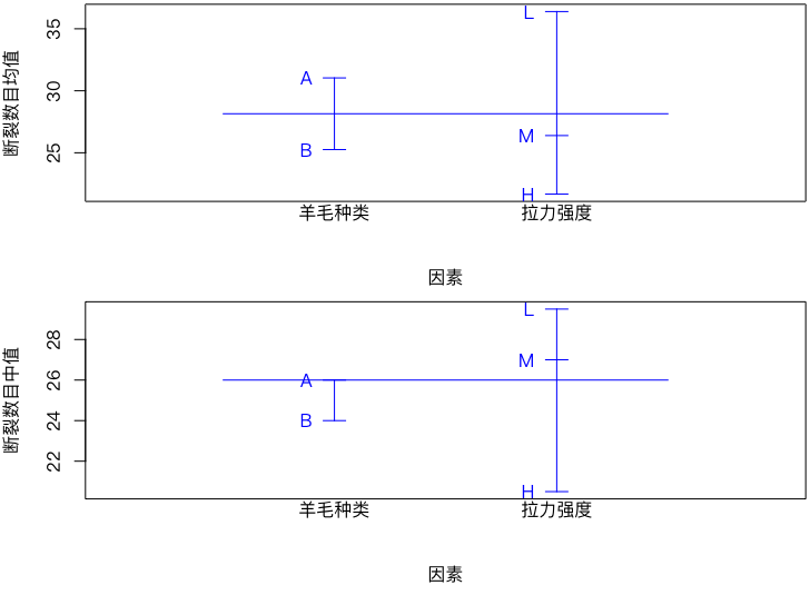
base R
## 经纱断裂数据的因素效应图
data(warpbreaks)
names(warpbreaks) = c("断裂数目", "羊毛种类", "拉力强度")
par(mfrow = c(2, 1), mar = c(4.5, 4, 0.2, 0.2))
plot.design(warpbreaks, col = "blue",
            xlab = "因素", ylab = "断裂数目均值")
plot.design(warpbreaks, fun = median, col = "blue",
            xlab = "因素", ylab = "断裂数目中值")
Forest maps
The name Forest Plot is a little strange, but in fact we have used it in many places without a specific introduction.
Basic introduction
Forest maps are used to visualize the effects of multiple studies and to compare the confidence zones, and are usually used to aggregate and compare the results of different studies, especially in meta-Anallysis. Of course, the Cox scale risk regression model that we've built before can also show results using forest maps.
As can be seen from the definition, forest maps are available in all places where a comparison of effects is needed. Each line in the figure represents a study or model variable: a point expression of impact estimates, a horizontal segment of confidence interval; all results are organized vertically to produce a visual effect like forest trees. For such values as HR, OR and RR, the reference lines are usually located 1;for the mean margin index, the reference line is usually located 0。
In the condensation analysis, each line usually corresponds to a study and the overall effect can also be expressed in a diamond form; in the regression model, each line corresponds to a self-variant. The single-factor forest map is now less used and is largely based on multi-factor forest maps: It also shows the direction of the variables in the model, the amount of effects and the estimated uncertainty. Specific methods of drawing can be used to continue searching, and the rationale is not complex.
Graphics Example
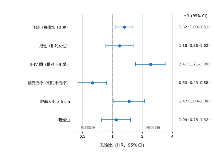
The above figure simulates a set of multiple factors Cox returns. The blue dot is the estimated risk ratio (Hazard Ratio, HR) and the line is 95% CI, the dotted line indicates no effect. HR = 1I don't know. The direction of the effect is clearer when the confidence interval falls entirely on the side of the reference line; if the range passes through the reference line, there remains greater uncertainty about the effect of this variable.
base R
## 基础作图法绘制多因素 Cox 回归结果的森林图
forest_data = data.frame(
  variable = c("年龄(每增加 10 岁)", "男性(相对女性)",
               "III–IV 期(相对 I–II 期)", "接受治疗(相对未治疗)",
               "肿瘤大小 ≥ 5 cm", "吸烟史"),
  hr = c(1.32, 1.18, 2.41, 0.63, 1.47, 1.09),
  lower = c(1.08, 0.86, 1.71, 0.45, 1.03, 0.78),
  upper = c(1.61, 1.62, 3.39, 0.88, 2.09, 1.52)
)
forest_data = forest_data[nrow(forest_data):1, ]
positions = seq_len(nrow(forest_data))

par(mar = c(4, 11, 0.5, 0.5))
plot(forest_data$hr, positions, type = "n", log = "x",
     xlim = c(0.4, 4), ylim = c(0.5, nrow(forest_data) + 0.5),
     xaxt = "n", yaxt = "n",
     xlab = "风险比(HR,95% CI)", ylab = "")
axis(1, at = c(0.5, 1, 2, 4), labels = c("0.5", "1", "2", "4"))
axis(2, at = positions, labels = forest_data$variable, las = 1)
abline(v = 1, lty = 2, col = "grey50")
arrows(forest_data$lower, positions, forest_data$upper, positions,
       angle = 90, code = 3, length = 0.05, col = "#1f77b4")
points(forest_data$hr, positions, pch = 19, col = "#1f77b4")
Interactive Impact Chart
In regression models or differential analyses, we often encounter the concept of interaction; interactive effect maps are generally for interaction between classification variables
When looking at the level of a classification variable given, the change in the average of the variables under the levels of the other classification variable indicates that there is no interaction between the two classification variables if the trend remains the same after the change of the previous classification variable to an extraction level.
Basic introduction
The function of the interactive effect chart in R is interaction.plot()
x.factoris the classification variable on the cross-coordinate;trace.factorIt's the second classification variable, depending on the level of extraction of this classification variable.x.factorInterconnecting with the mean of the variable under the classification;responseis due to variables;funis the function specified for the attribute aggregation, default is the average, and of course we can also specify other calculation functions such as the medianmedian()
Graphics Example

base R
## 法国食道癌数据的交互效应图
data(esoph)
par(mar = c(4, 4, 0.2, 0.2))
with(esoph, {
  interaction.plot(agegp, alcgp, ncases / (ncases + ncontrols),
                   trace.label = "饮酒量", fixed = TRUE,
                   xlab = "年龄", ylab = "患癌概率")
})
Classification and regression (decision tree)
Categorization and regression Tree, CART, is a recursive separation (Recursive Partition) technique that seeks to separate some of the variables, leaving the sample split with the greatest variation between groups of variables. This division will continue until the conditions for cessation are met. He's the model of the decision tree we're studying.
Basic introduction
rpart The package provides a calculation function for classification and regression tree rpart() , the function package also expands the generic function plot() , any part-type object is automatically called when drawing plot.rpart() Generates tree maps.
We're breaking away.mlr3After all, it's just an integration, and it's bound to leave the original function behind to streamline it.
xAn object of a rpart type, usually byrpart()(a) Functions to be produced together;uniformWhether or not to use the same vertical distance between top-down branch nodes in order to prevent the branches from being too close to certain local areas to be easily identifiable.branchSets the shape of the branch, 0 as the "V " font, 1 as a vertical shape, which you can take$[0,1]$ between values to make the value shape more like " V " or more vertical;compressSets whether the spacing of branches is reduced horizontally to make the graphic more compact
Graphics Example
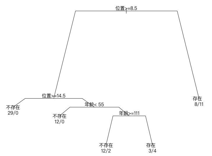
base R
## 脊椎矫正手术结果的分类树图
library(rpart)
data(kyphosis, package = "rpart")
levels(kyphosis$Kyphosis) = c("不存在", "存在")
names(kyphosis)[c(2, 4)] = c("年龄", "位置")
fit = rpart(Kyphosis ~ `年龄` + Number + `位置`, data = kyphosis)
par(mar = rep(1, 4), xpd = TRUE)
plot(fit, branch = 0.7)
text(fit, use.n = TRUE, digits = 7)
Parallel Coordinate Chart
Parallel coordinates are an alternative to normal Cartesian coordinate thinking, and we know that the Cartesian coordinate system normally accommodates only two variables at most (cross-axis x axis y), so it is not possible to draw multiple variables directly under such coordinates, and, of course, there are a number of alternatives mentioned earlier that allow multiple data to be expressed under Cartesian coordinates.
The basic approach for parallel coordinate systems is to convert the vertical axis of each other into a parallel axis, where multiple variables can be placed, as the plane can accommodate many parallel lines.
For one line of observations, because of the number of columns, each column corresponds to a point on a parallel line, which, in the end, we link together and form the basic elements that form the parallel map.
Similarly, multiple rows of data can draw multiple lines, and parallel coordinates are made up of these lines with the corresponding parallel axis.
The parallel map has a lot of ways to achieve it.ggplot2System GGally Package ggparcoord() Functions
Parallel coordinate maps are also used as contours, but at this point the average sample points are smaller
Graphics Example
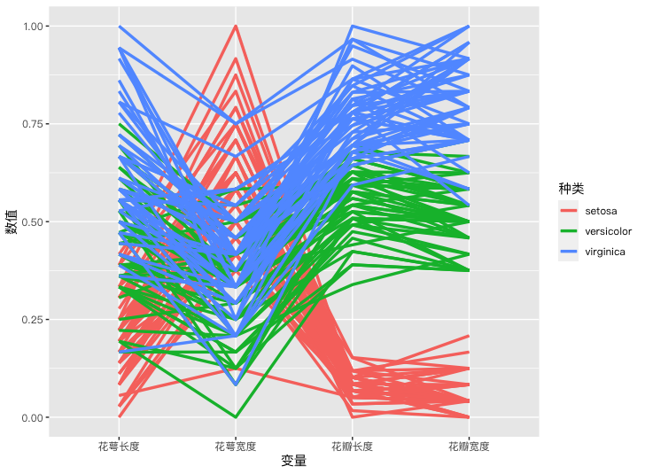
The intersection of the middle segment of the parallel map means negative, parallel, positive.
Because the parallel map draws a number of variables, sometimes we can use the position of the middle line to observe the concentration phenomenon.
The order of variables in the parallel map is very important, as it directly affects the appearance of the map and limits our observation of the data, especially its relevance, since it is only possible to observe the relationship between adjacent variables from the parallel map. Sometimes the order of variables is exchanged, and perhaps new information is observed.
ggplot
## 鸢尾花数据的平行坐标图
data("iris")
library(GGally)
names(iris)[1:4] = c("花萼长度", "花萼宽度", "花瓣长度", "花瓣宽度")
p = ggparcoord(iris, columns = 1:4,
               groupColumn = 5, scale = "uniminmax") +
  geom_line(size = 1.2) +
  labs(x = "变量", y = "数值", color = "种类")
print(p)
Combine Curve
The concoction curve is presented by Andrews, which is a sophisticated technique for displaying multiple data.
Math principles
For a Data Matrix$X_{n\times p}$♪ We put every line of it ♪$X_i=(X_{i,1},\ldots,X_{i,p})$ To a curve: $$\left.f=(t)=\left}begin{array}}frac{X i,}{\sqrt{2}+X i,}cos(t)+cdots\X i,p\\\sin+t)+xXx+ \frac{t)+xXi,p}x i,p},p}x i,p}\cos(\t){&\\text{p\text{x{i,}}{\sqrt{2}}x{i,2}\sin(t)+X i,3}\cos(t)+cdots\X i,p}\sin(\frac{p}2}t)&\text{p\text{even}\end{right.\right.$
of which$t\in[-\pi,\pi]$I don't know. This way, will you?$t$ If you take a series of values, you can draw a curve for each line of observations, and eventually you can. $n$ A bar curve is formed. A concoction curve. This mathematical transformation appears to be intuitive, yet it has a lot of good mathematical properties and practical implications, and here are just two examples:
- If we use it... $L_{2}$ It's a model to measure the distance between the two curves, so the distance is exactly the same as the distance from the Oxygen squared. $\pi$ Multiply, in other words, the distance between the two lines of observation can happen to be the difference between the two curves in the picture. This nature allows us to observe in a visual way the phenomenon of clustering and detached points, since the concepts of clustering and detached points are based on distance (there are many definitions of distance, here using the squares of the occupant distance). If the reader is interested, you can verify this. $L_{2}$ Results of the model:
$$ \int_{-\pi}^\pi\left(f_i(t)-f_j(t)\right)^2dt=\pi\sum_{k=1}^p\left(X_{i,k}-X_{j,k}\right)^2 $$
- This shift is somewhat linear: if one observation $X_l$ All values are less than $X_i$ More than $X_j$, on the concoction curve $X_l$ The corresponding curve is also located in $X_i$ and $X_j$ Between. This is of a very obvious nature. Both properties are used temporarily to analyse concoction graphics
Basic introduction
ReferenceMSGPackage andrews_curve() Functions
- x is the data matrix
- n Number of points for drawing curves
There's information, there's a package. andrews A function that can be used to draw the curve is provided, although the graphic precision program is slightly less.
Graphics Example
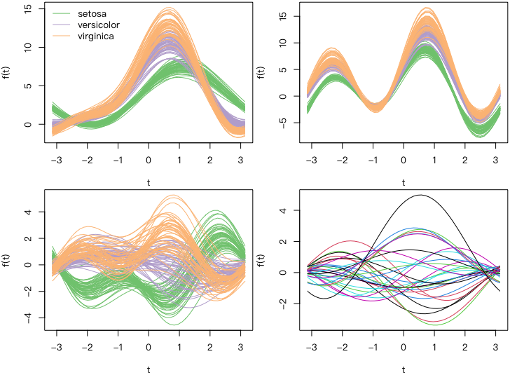
MSG
## 鸢尾花数据和黑莓树数据的调和曲线图
data(iris)
data(trees)
library(MSG)
iris.col = vec2col(iris$Species)
par(mfrow = c(2, 2))
par(mar = c(4, 4, 0.2, 0.2))
andrews_curve(iris[, 1:4], n = 50, col = iris.col,
              xlab = "t", ylab = "f(t)")
legend("topleft", col = unique(iris.col), lty = 1, bty = "n",
       legend = unique(iris$Species))
andrews_curve(iris[, c(3, 4, 2, 1)], n = 50, col = iris.col,
              xlab = "t", ylab = "f(t)")
andrews_curve(scale(iris[, 1:4]), n = 50, col = iris.col,
              xlab = "t", ylab = "f(t)")
x = andrews_curve(scale(trees), n = 50,
                   xlab = "t", ylab = "f(t)")
Matrix Graphics
The matrix graphics have two variables in direct view, the line coordinates and the column coordinates, but it's also a value that should be taken from each of the coordinates because it's really special in form, so here's a separate introduction.
Waiting for high maps and contours
It's a way of lowering the original three-dimensional matrix data. After all, it's hard to find the right angle for all the information.
The idea of a high map comes from a geographical contours, but it turns the coordinates into a non-continuous matrix.
Basic introduction
R to draw e.g. high maps and contours contour Functions
nlevelsSet the number of lines at the same height, and the more it gets, the more it gets.levelsSet an equal high line$z$Value to be connected at point near this valuemethonSet Drawing MethodsimpleEnd of online tagedgeEmbedded TabsflattestPlaces on the online levelxandyis the vector of the grid point, which defines the position of the peg on the 2D planezIt's a matrix. It's a matrix.(x, y)Function on Grid Point
Graphics Example
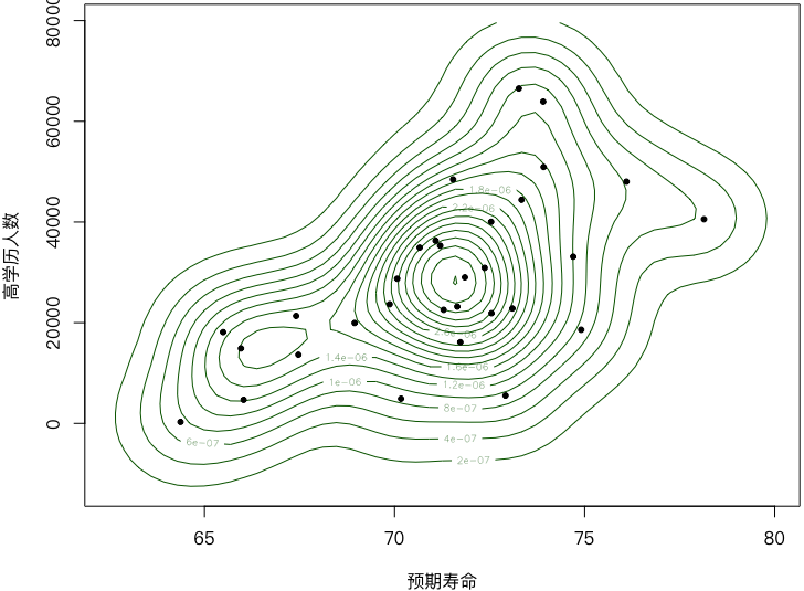 Consorption is a group feature.
base R
## 基础作图法绘制中国 31 地区国民预期寿命和高学历人数密度等高图
library(KernSmooth)
data(ChinaLifeEdu, package = "MSG")
par(mar = c(4, 4, 0.2, 0.2))
est = bkde2D(ChinaLifeEdu, apply(ChinaLifeEdu, 2, dpik))
contour(est$x1, est$x2, est$fhat, nlevels = 15, col = "darkgreen",
        vfont = c("sans serif", "plain"),
        xlab = "预期寿命", ylab = "高学历人数")
points(ChinaLifeEdu, pch = 20)
ggplot
## ggplot2 绘制中国 31 地区国民预期寿命和高学历人数密度等高图
library(KernSmooth)
library(metR)
data(ChinaLifeEdu, package = "MSG")
est = bkde2D(ChinaLifeEdu, apply(ChinaLifeEdu, 2, dpik))
est_tidy = data.frame(
  life = rep(est$x1, length(est$x2)),
  edu = rep(est$x2, each = length(est$x1)),
  z = as.vector(est$fhat)
)
levels = pretty(range(est_tidy$z, finite = TRUE), 15)
p = ggplot(est_tidy, aes(life, edu)) +
  geom_contour(aes(z = z), breaks = levels) +
  geom_text_contour(aes(z = z)) +
  geom_point(aes(Life.Expectancy, High.Edu.NO), data = ChinaLifeEdu) +
  labs(x ="预期寿命", y = "高学历人数")
print(p)
Colours high
It doesn't make any difference in principle to the height of the grade.
Basic introduction
The color equal high graph function in R is filled.contour()
Most parameters and contour() The function is exactly the same, and the difference is that there are several more parameters that define colours.
Graphics Example
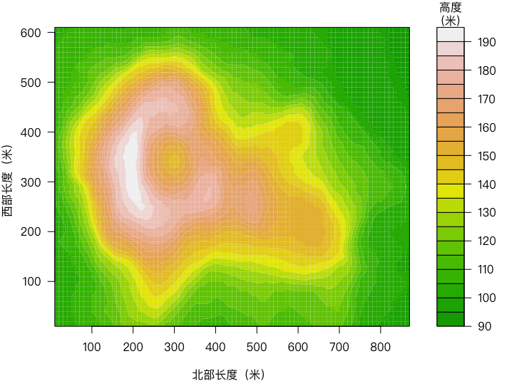
base R
## 火山高度数据颜色等高图
par(mar = c(4, 4, 2, 2), cex.main = 1)
x = 10 * 1:nrow(volcano)
y = 10 * 1:ncol(volcano)
filled.contour(x, y, volcano,
               color = terrain.colors,
               plot.title = title(
                 xlab = "北部长度(米)", ylab = "西部长度(米)"
               ),
               plot.axes = {
                 axis(1, seq(100, 800, by = 100))
                 axis(2, seq(100, 600, by = 100))
               },
               key.title = title(main = "高度\n(米)"),
               key.axes = axis(4, seq(90, 190, by = 10))
)
Colour Chart
The colour map is a softened image of heights, so we don't do smooth processing, but we do simple colour mapping of a matrix, and color squares are the size of a number.
Colour maps are a visualization tool for matrix data, such as the Aligning Matrix.
Because the relevant coefficient colours are used too widely, we study them separately.Related coefficient heat
Basic introduction
The function of the colour chart in R is image()
- Parameters
x、y、zSimilar to the parameters of the contours colSet a colour sequence to map values of different sizesbreaksOrganisationzEndpoint of the segment
Graphics Example
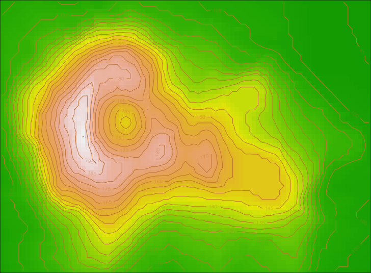
base R
## 基础作图法绘制火山高度数据颜色图
data(volcano)
par(mar = rep(0, 4), ann = FALSE)
x = 10 * (1:nrow(volcano))
y = 10 * (1:ncol(volcano))
image(x, y, volcano, col = terrain.colors(100), axes = FALSE)
contour(x, y, volcano, levels = seq(90, 200, by = 5),
        add = TRUE, col = "peru")
box()
ggplot
## ggplot2 绘制火山高度数据颜色图
data(volcano)
library(ggplot2)
p = ggplot(transform(reshape2::melt(volcano),
                 x = Var1 * 10, y = Var2 * 10),
       aes(x = x, y = y, z = value, fill = value)) +
  geom_tile() +
  geom_contour() +
  scale_fill_distiller(palette="RdYlGn") +
  labs(x = "北部长度(米)", y = "西部长度(米)",
       fill = "高度\n(米)")
print(p)
3-D view
That's the 3D of the contours.
Naturally. ggplot2 It won't provide the solution we need.
Basic introduction
The function of the medium-through view for R is persp()
- Parameters
x、y、zSimilar to the parameters of the contours thetaandphiSet the angles for the rotation of the 3D graphics in the right, right and down directions, respectivelyrSet the distance between the eyes and the center of the lens view
Special
- grDevices The package provides a related 3-D lens view conversion function
trans3d(), it converts the three-dimensional coordinates of a space point to a flat coordinate according to the characteristics of the perceiving view, so that we can easily use the general bottom-forming function to add graphic elements to the stereo map - scatterplot3d As a dedicated three-dimensional drawing package, the package offers a lot of graphics.
- rglA package based on OpenCV provides interactive 3D graphics
Graphics Example
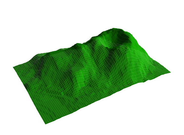
base R
## 火山的三维透视图
data("volcano")
z = volcano
x = 4 * (1:nrow(z))
y = 4 * (1:ncol(z))
par(mar = rep(0, 4))
persp(x, y, z, theta = 150, phi = 30, col = "green3", ltheta = -120,
      shade = 0.75, scale = FALSE, border = NA, box = FALSE)
Matrix, matrix points, matrix lines
The name of the matrix is derived from its parameter type, which can express all columns in a curve, the same meta-function curve, for a matrix FigureA one-digit function curveAgain, there's nothing special about it. It's just a convenient cover. We don't have to call. lines() equals draw curves of all columns of the matrix in turn.
Basic introduction
The function of the matrix in R is matplot(), the function of the matrix point is matpoints(), the function of the matrix is matlines()
Functions matplot() High-level graphic functions (creation of new graphics), the latter two functions being lower-level graphic functions (adding elements to existing graphics)
- Parameters
xandyTo enter the matrix, the pattern is made usingxand the variables listed in the cross-axis direction,y, and then use these columns to make a dispersed map (in turn).xThe first row against the first row of y,x2nd row pairy2nd column, in descending order); - If one of these two parameters is missing, then the x will be
1:nrow(y)Replace
Graphics Example
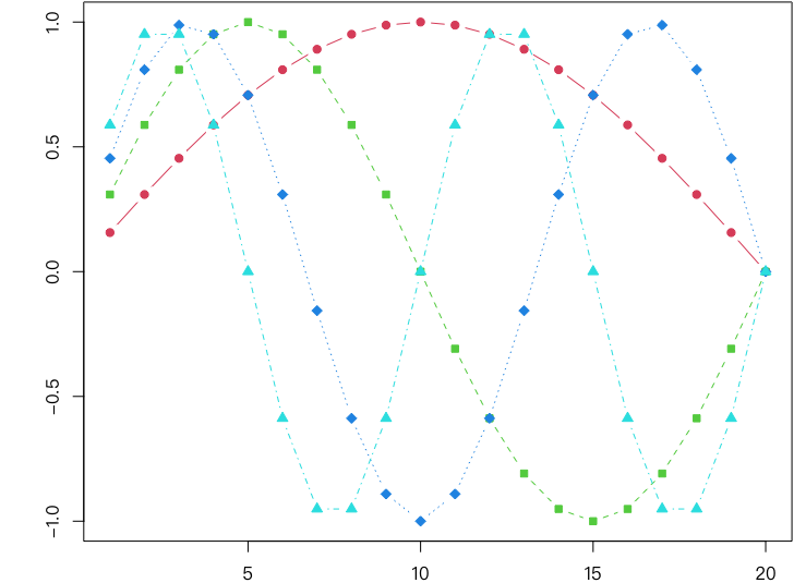
base R
## 基础作图法用矩阵图画出的一系列正弦曲线
sines = outer(1:20, 1:4, function(x, y) sin(x / 20 * pi * y))
par(mar = c(2, 4, .1, .1))
matplot(sines, type = "b", pch = 21:24, col = 2:5, bg = 2:5)
## 数据矩阵的前 6 行
round(head(sines), 5)
ggplot
## ggplot2 画出的一系列正弦曲线
sines = outer(1:20, 1:4, function(x, y) sin(x / 20 * pi * y))
df = expand.grid(x = 1:20, y = factor(1:4))
df$sines = as.vector(sines)
p = ggplot(df, aes(x = x, y = sines, color = y)) +
  geom_point(aes(shape = y)) +
  geom_line()
print(p)
Hot Chart
The heat map is achieved by adding rows and columns to the colour map, and he'll prepare us a spectrograph that will reflect some of the group characteristics.
Heapmap itself does not provide the ability to add numbers, nor is it easy to add legends, so it is generally not used for the drawing of relevant coefficients, but only for cluster problems.
Basic introduction
Thermal chart function for R stats Package heatmap()
- of which
xIt is a data matrix, which can only be a matrix, not a data frame or other type; RowvandColvdetermines how rows and columns are calculated and reordered asNULL(Default) reorder rows and columns by hierarchical grouping and draw spectrographs accordingly ifNAIf so, no spectrograph;distfunDetermines which function to calculate the distance to further calculate the grouping, default todist();hclustfun(a) the function to be used to calculate the hierarchy;...Parameters passed toimage()So we can still use it.image(), for examplecolSets the colour series of cells
Graphics Example
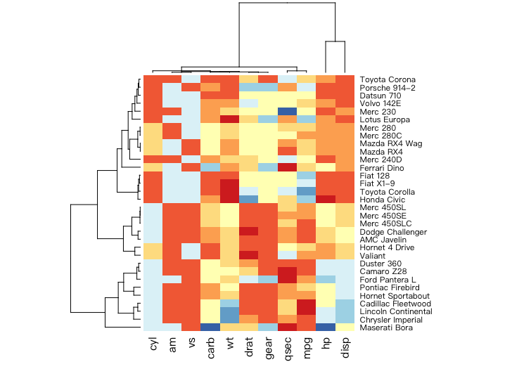
base R
## 汽车数据的热图
## 用极端化调色板
library(RColorBrewer)
heatmap(as.matrix(mtcars), col = brewer.pal(9, "RdYlBu"),
        scale = "column", margins = c(4, 8))
Link Chart
Associated Chart (Cohen-Friendly Association Plot) is a tool for displaying data from the 2-D Tables. It is based mainly on the Pearson χ2 test of the Tables' independence theory. It shows that the data are in line with our expectations.
Basic introduction
The function of the correlation chart in R is assocplot()
- of which
xData for a column (or matrix); col(a) The colour of the upper and lower rectangle;spaceto set the spacing between rectangles.
Graphics Example
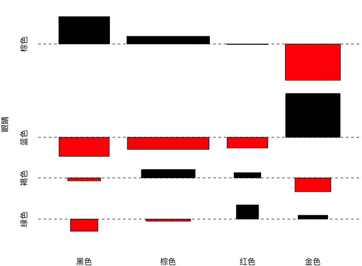
base R
## 眼睛颜色与头发颜色的关联图
data(HairEyeColor)
x = margin.table(HairEyeColor, c(1, 2))
rownames(x) = c("黑色", "棕色", "红色", "金色")
colnames(x) = c("棕色", "蓝色", "褐色", "绿色")
assocplot(x, xlab = "头发", ylab = "眼睛")
Four National Maps
FourFold Plot is a graphic tool for looking at the correlation between two dichotomy variables in the 2x2xk column table, which is based mainly on the test theory of the 2-D list.
It tests the list from the perspective of Odds Ratio, OR,
It's a good comparison between two four-percent radiuss, and if there's a significant difference in the two fan radiuss, the column variable is not independent, i.e. the factor has an impact on the event, which is the most basic use of the Quadrilateral, and there's a calculation of the Quadrilateral, which is also shown in the Quadrilateral with two arcs. There is no overlap between confidence-building arcs, which means that the zero hypothesis cannot be rejected, and vice versa. This is based on the relationship between the hypothetical tests and the estimates.
Basic introduction
Four-Purpose Functions for R fourfoldplot()
xis a 2x2xk array that can also take a 2x2 matrix directly when k=1;colorSets a one-quarter circle colour for filling, with the same sector colour on the same diagonal line, and the order of colour filling also reflects the size of the ratio to 1;onf.levelAs a level of confidence;stdThe division of the denominator at the time of standardization was determined for the standardized method of the list.- When k≥1, this function will generate k four-polvee in order
Graphics Example
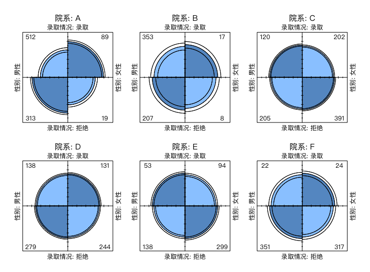
base R
## 加州伯克利分校录取数据四瓣图
data("UCBAdmissions")
dimnames(UCBAdmissions) <-
  list(`录取情况` = c("录取", "拒绝"),
       `性别`= c("男性", "女性"),
       `院系` = LETTERS[1:6])
fourfoldplot(UCBAdmissions, mfcol = c(2, 3)) # 2 行 3 列排版
Related coefficient heat
Thermal maps of relevance (relevance maps) are believed to be one of the most familiar data visualization methods, with a high frequency of occurrence in various literatures. A correlation map is a hot map indicating the correlation between the two variables, and almost all data expressing the correlation value can be visualized using the correlation map.
The most easily used relevant coefficients of heat are: ggcorrplot Packaged ggcorrplot
All he needs to do is provide him with a data matrix, and he's drawing what we're looking for. ggplot2 Make a drawing, but he redos the function to satisfy the base R norm
If you want to use base R method, you can use corrgram The bag. corrgram Functions and corrplot Yes. corrplot Functions
- Title: R Statistical Visualization: Univariate, Multivariate, and Functional Data Graphics
- Author: Hyacehila
- Created at : 2024-03-15 08:54:45
- Link: https://hyacehila.github.io//blog/2024/03/15/r-visualization-learning-notes/
- License: This work is licensed under CC BY-NC-SA 4.0.