
R Statistical Graphics: Base Graphics, lattice, and ggplot2

We would like to talk about how we should make the drawings, that is, the principle of drawing them, before they start.
We're moving to the full library. R VisualizationIt is presented, thus reducing the reading burden.
Classic Graphics
The point of statistical graphics is to guide us in observing the information in statistics. The greatest value of a graphic is when it reaches us to notice what we never expected to see. In this sense, the importance of statistical graphics is self-evident.
In the history of statistical graphics, there are not many images that can reach the height of "discovering unforeseeable information".
The origin of the pie and the line.
Both the pie and the graphs are based on very long-standing statistics, and they're all invented by Playfair; although they don't look strange now, they're almost 300 years old.
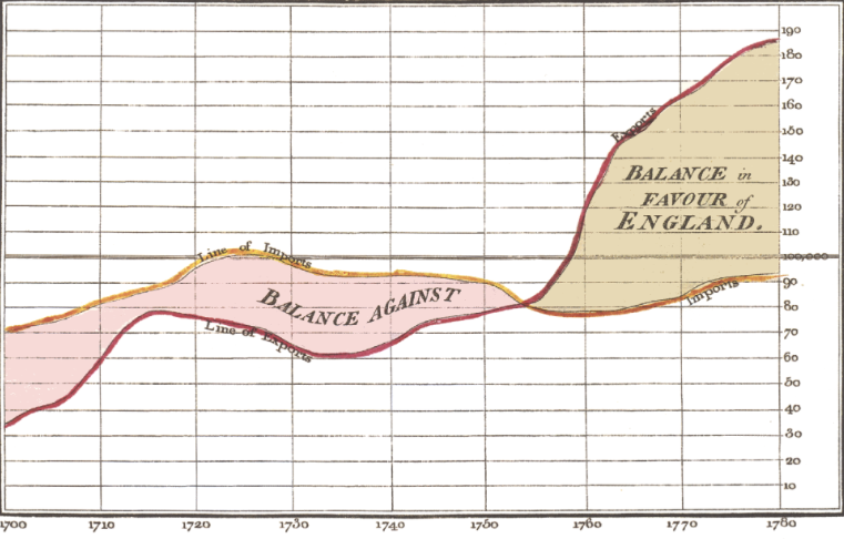 This chart shows the time series of imports and exports of England between 1700 and 1780, and the left shows that foreign trade is not good for England, while foreign trade has gradually become beneficial after about 1752.
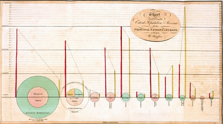 Large maps above show the size of each country ' s territory (in proportion to the circle) and the population (in proportion to the left) and tax revenues (in proportion to the right) and the proportion of the country distributed across all continents.
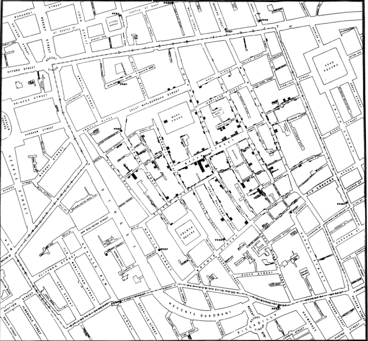
Cholera transmission
John Snow found clear geographical patterns in the location of the deaths, as shown in the figure below.
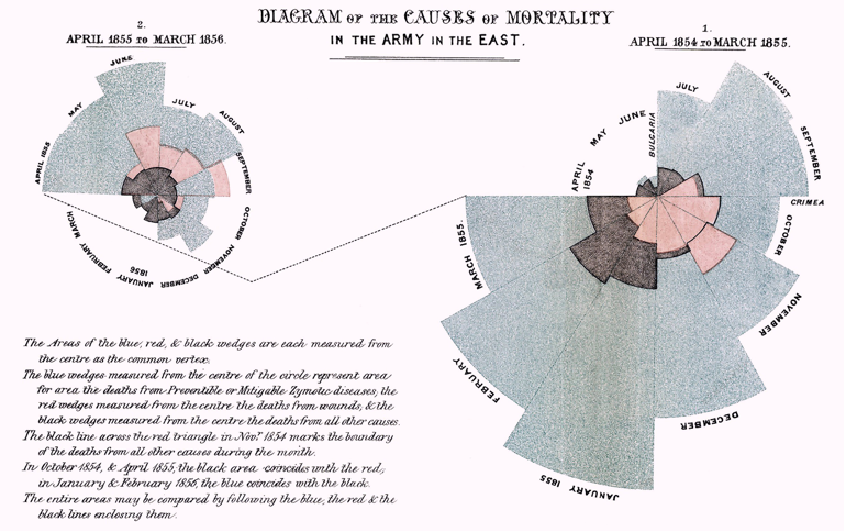
Rose Chart
Nightingale was a pioneer in the historical use of polar coordinates. It's like a rose, and it's later called a rose map. The main idea is to use the area of the petal as the size of the statistical value.
The Rose Map not only clearly illustrates the change in the number of military deaths in the two years, but, more importantly, she has marked three deaths per month in different colours: Blue means death from preventable diseases, red means death from war, black means death from other causes. In this way, we can clearly understand the structure of the causes of military casualties, especially “the vast majority of soldiers die from preventable diseases” (the highest petals in the picture). With this important message, she has made the British Government aware that what really affects war casualties is not the war itself, but the lack of effective medical care by the army!
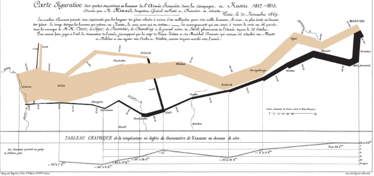
Napoleon's Russian expedition.
The maps produced by Minard show the route (first half) of Napoleon's legions marching into Russia in 1812 and the temperature changes (second half) during the withdrawal. In this historic event, there was a dramatic decline in the number of French troops and an all-embracing picture of harsh weather conditions.
It includes the following information.
- Position and direction of the army, as well as branching and integration of the army on the way
- Reduction in the number of soldiers
- The temperature changes during the evacuation are shown in the lower half of the chart.

Summary and beginning
Each of the first four subsections of statistics was created before the computer was born, all by hand, by the author; but without prejudice, they were of great value.
There are, of course, a large number of successful researchers in the area of statistical graphics who have contributed a lot to the development of statistical graphics; here is a brief introduction.
It's more famous to have data on da Vinci.Data-Ink Ratio and Minimizing Chartjunk He's got a lot of work worth reading. Look.
The real integration of statistical graphics into the mainstream depends on John.W. Tukey, who's proposed exploratory data analysis technology, has led to a new direction in statistics that has injected a new dynamism into the dominant statistical community, with the main tool for exploratory data analysis being statistical graphics.
Wilkinson offers a good framework for a more theoretical interpretation of statistical graphics, which is the basis for ggplot's birth.
He's probably one of the first statisticians to study the impact of statistical graphics on readers' mental awareness.
M. Friendly and Denis collated and documented more influential statistical images from the centuries before the 17th century to the present.
Recent statistics, using John.W.Tukey's exploratory data analysis as a landmark starting point, have produced a large number of graphic works and graphic types that are mathematically statistically significant and computer-enabled.
The development of modern statistical graphics is more focused on the development of computer tools and the presentation of high-dimensional and dynamic graphics. One of the classics of high-dimensional graphics is a parallel map of coordinates that breaks the normal Cartesian coordinate system; as for dynamic graphics software, we'll stay at the end of the book to explain it.
Traditional statistical analysis can be divided into about three categories:
- Descriptive statistical analysis:
- Hypothetical statistical analysis:
- Explored statistical analysis: Exploratory Statistical Analysis
The former are based on a number of statistical models, which are based on statistical methods.More graphic-based analysis of exploratory dataIn order to use this tool, it is necessary to have a clear understanding of how to map and what types of graphics are available in order to truly develop the value of statistical graphics.
The concept of “graphic statistical analysis” is not a new one, and the usual statistical images have been used to a greater or lesser extent, except that we tend to prefer statistical model analysis in a mathematical sense rather than using graphic statistical analysis as the main analytical tool. Of course, the limitations of graphic expression and the availability of statistical data make it impossible to replace model analysis.
In particular, there's subjectivity in data interpretation.
Before the Tuco
Tools
We make the following three requests for statistical tools:
- Full statistical computing capability
- Statistical elements are easy to control.
- Graphic types are diverse
The primary function of graphics is indeed to visualize information, but the information here is not necessarily simple.A good statistical picture may hide important statistics, which are the most critical component of statistical graphics.
Excel is the most common statistical graphic tool, but Excel appears to have only three graphics overall.
- The first is the expression of absolute value sizes, such as bar charts, column charts, circuit charts, etc.
- The second is performance, like pie.
- The third is a variable relationship on a 2-D plane, such as an X-Y scattered map;
- In a broader sense, Excel presents almost all raw data, and statistical extrapolations based on data mean less.
Excel now provides the capability of a data lens table, which is essentially an interactive graphical interface that brings together three basic graphics and provides a fixed format for displaying them or for displaying raw data. On how Excel's graphics fit colours and become stereotypic, they can't skip the three types of limitations above, and they can't fully express the key to statistics.
Statistical graphics are intuitive, but they're not simple, they're not speculative, they're not a stack of raw data.
The core of statistics isn't looking at how the data are going to show it, but they're trying to extrapolate it from data, and in classical statistics, distribution is the most important thing that we need to study; concepts like averages, differentials, correlations, and probabilities can be grouped into distribution.
From here, we've found what really matters. Statistics are at the heart of statistical drawings, and the more complex they are, the more complex they are, or the aggregation of them, they mean statistical graphics that contain more data, and how they are designed is at the heart of how they are designed to remain visual.
The menu-based GUI interface is not a “perfect” statistical mapping method, and the GUI is unlikely to increase indefinitely, but statistical graphics will; closed-source software operated by a single company will not be an excellent statistical mapping method, because they cannot keep up with the fast-growing academic community, but will have to hang on;
An open-source, pure-coded platform is the best way to map statistics, so R and Python will be the end of modern statistical mapping until a new, epoch-making pattern is discovered and abandoned the old system.
We say that graphics do not mean simple, that statistical graphics can be constructed in a very nuanced way (including the selection of statistical quantities and the design of graphic elements), rather than that the mapping process or procedures are complex. We need to find a balance between efficiency and beauty.
At the end of the tool section, we redraw it with R code.Napoleon's Russian expedition. Figure. Understanding his high self-defined level.
troops <- read.table(system.file("extdata", "troops.txt", package = "MSG"), header = TRUE)
cities <- read.table(system.file("extdata", "cities.txt", package = "MSG"), header = TRUE)
library(ggplot2)
p <- ggplot(cities, aes(x = long, y = lat)) # 框架
p <- p + geom_path(aes(size = survivors, colour = direction, group = group),
                   data = troops, lineend = "round") # 军队路线
p <- p + geom_point() # 城市点
p <- p + geom_text(aes(label = city), hjust = 0, vjust = 1, size = 2.5) # 城市名称
p <- p + scale_colour_manual(values = c("grey50", "red")) +
  scale_size(range = c(1, 10)) +
  theme(legend.position = "none") +
  xlim(24, 39) # 细节调整工作
print(p) # 打印全图
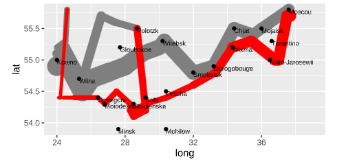
Here are some examples of the creation of statistical graphics and possible problems in their application.
Price trends
We're using a manual data set to see what we're going to do with him.
year <- c(2006, 2007, 2008, 2009, 2010 + c(1, 4, 7, 10, 13) / 12)
price <- c(12.11, 18.8, 22.09, 18.39, 19.86, 14.89, 16.68, 18.76, 19.57)
And we can find that the four-sided coordinates of this data set correspond to a year, and the five-sided coordinates turn into three months, and see what happens when you make a straight line.
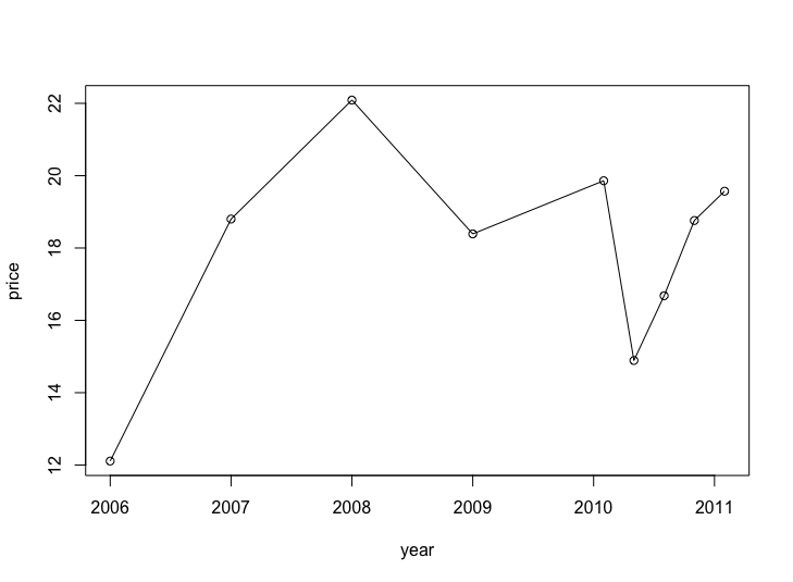 R automatically helps us to compress the back line; if you allow the cross-coordinate equidistance to be mapped, the original growth will be smooth. We've made some of the tricks in statistical graphics that can change the reader's first feeling.
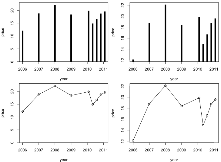
Besides, in drawing this time series, we might...I'm thinking about a line or histogram, and I'm thinking about zero starting with zero or the smallest.
- Bar diagrams easily observe the size of the difference (the length of the comparative bar)
- And it's easier to see the slope size.
- If we pick zero on the real zero, it's easier to calculate the real ratio.
- If the minimum value is selected, then it is easier to see absolute variation (because the difference is “magnified”)
Give the corresponding graphics
Actors' pay.
We gather information about the names of the actors, the names of the TV plays, the categories (rent Drama or comedy), the average income, the sex of the actors, the IMDB rating, etc., to consider the link between pay and gender, pay and work rating (including the type of work).
The direct comparative distribution of gender-specific pay is very intuitive. He could be seen as a means of similar return to the binary.
LOWESS Local Weighted Return Fragment Smoothing; he extracts local data for multi-formulation, then repeats the process until complete data is prepared, and can be considered as a non-parametric method that has a good advantage over return
Figure
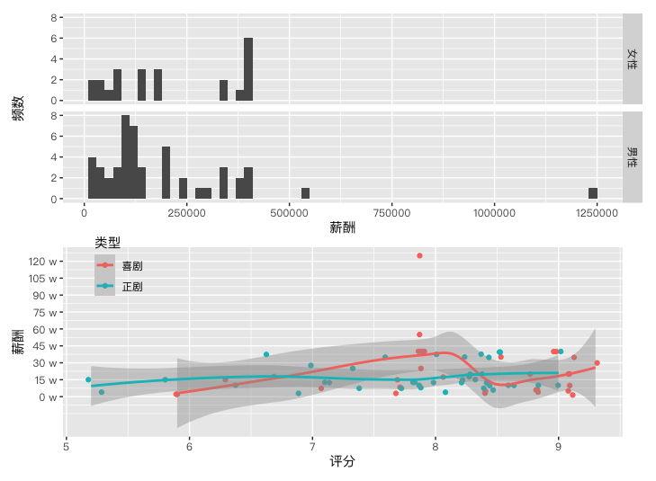 Histogram visualizes the gender-reversive pay differential: it can be seen that the average remuneration of actresses is slightly higher than that of male actors.
The IMDB rating seems to have nothing to do with the actor's pay, and the curve is almost a horizontal line; for comedy, it's not a straight line, and it's the highest in the vicinity of 7.9.
Sound of Music
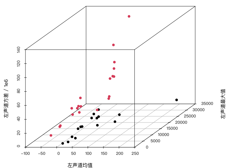
The data contained 36 tracks, including classical music such as Mozart and Vivaldi, and rock music such as Abbas and Eels. In addition to the type of track (classical or rocking), we use only three continuous variables: average, maximum and variance of left audio frequency.
For such data, our concern may be whether classical music and rock music differ from audio variables; for this three-dimensional data, our most intuitive idea is a three-dimensional spread. Figure
 The parallel coordinates and tunes and curves that we'll be introducing in the future will also be useful for this high-level data.
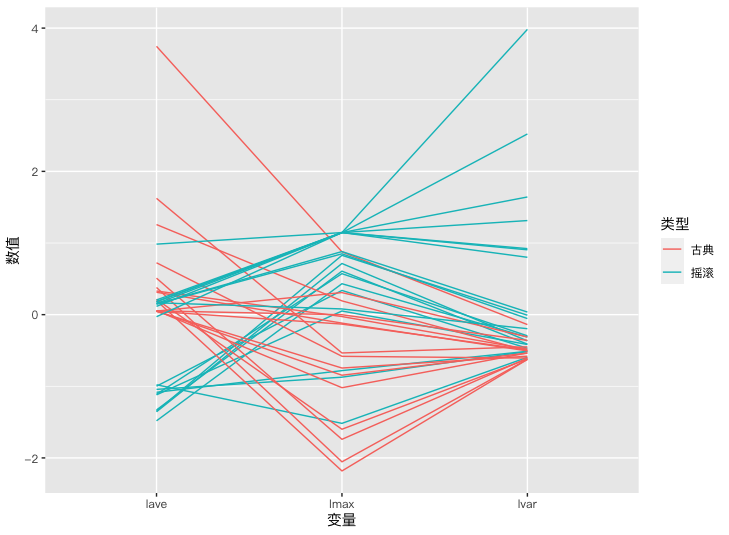
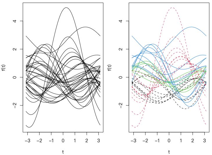
All three graphics show differences between different types of music. It's not always a good idea to have GVs.
Word Frequency Cluster
Each author has his or her own unique style, such as the length of the sentence paragraph, the customary use of words, etc. In literature, the use of statistical methods to study the author's writing style and to classify the author's work, and to judge cases that have long been very successful
We're thinking about dividing the words in the work of different authors by the usual verbs, finding some of the more frequent words, and then grouping the authors according to the verb vector, and getting the following figure.
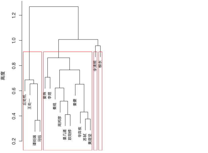 Our concentration is consistent with literature analysis.
And of course, we can look at the links between words, and see who's more likely to come together.
As traditional unstructured data, we tend to deal with a lot of things differently.
Library
Mapping experience
We've been looking at statistical graphics before, and technically, they don't have much technology; but a good picture isn't just what the technology and code can do, it's hard to get the right graphics for the right data.
Let's start from a data point of view and start with a summary of what we're talking about; then we'll start with some drawing principles, and then we'll start with a summary.
Graphic Selection
The simplest way to classify statistics is to divide them into qualitative data and quantitative data; in quantitative data, the focus of our research tends to be related to distribution; the defined data tends to start with frequency; the following table is a brief summary of the graphics described above.
| One-dimensional. | 2D | Garvey. | Matrix | |
|---|---|---|---|---|
| Disaggregated data | Bar Chart | Marcello. | Marcello. | |
| Linkage, Four Kingdoms | ||||
| Continuous data | Histogram | Scatter Chart | Parallel Coordinate Chart | Colour Chart |
| Line Chart | Scatter Chart Matrix, 3D Scatter | Hot Chart | ||
| Cleveland Point | Three-dimensional view, smooth breakpoint Figure | Waiting for High Chart | ||
| One-dimensional spreads | Star, symbol, face map | |||
| Mixed data | Conditional Density Chart | Conditional Partition Chart |
Disaggregated data
With regard to disaggregated data, we tend to be concerned about the frequency or proportion of each classification, which is often simple, and reading graphics is simply an eye-ordering exercise.
There are few options for one-dimensional disaggregated data, and the most common is a bar chart; in a multi-dimensional data situation, Marseektu is able to clearly express the frequency size of the cells in the column tables, and also to observe the marginal probabilities and probabilities of conditions in the tables.
In addition to graphics of a descriptive nature, we can also use an extrapolated correlation map, which gives us a clear picture of which cells contribute significantly to this “non-independent” conclusion if the row variable in the list is not independent, and a quadrilateral map, which allows us to read quickly whether the row variable in the list is independent, i.e. whether the fanring is overlapping.
Continuous data
This compares with a much broader expression of continuous data:
In a one-dimensional situation, we can display the probability distribution of the data in histograms and density curves, a summary of the data in a four-digit graphic (this is a rough distribution expression), an expression of the size of the original values in a Cleveland dot, or an expression of the original values and their rough distribution in a one-dimensional scattered dot;
The most commonly used in two-dimensional situations is a scatterchart, which is usually used to express linear or non-linear relationships between two continuous variables, and is often used in conjunction with other graphic elements, such as reconnecting lines; in three-dimensional situations, we can draw a three-dimensional breakchart, and for special three-dimensional data, we can draw a three-dimensional map.
High profile
It's also important to reduce high-dimensional graphics to low-dimensional representation.
Find carrier Looking for other dimensions of "carriers" on a 2D plane, these "carriers" have many possibilities, but they are attached to high-dimensional data with some properties of graphic elements, such as the symbol in the symbol chart, the large width of the symbol, the facial features in the face map.
Change Coordinate System The Cartesian coordinates are theoretically limited to two-dimensional variables, so the use of other coordinates is also a natural choice that extends to high dimensions, such as the asterisk map using asterisk coordinate systems, with one coordinate for each branch outside the centre; parallel coordinates are also a common tool for the expression of high-dimensional data, which converts vertical coordinates to parallels, while the plane is theoretically capable of containing an infinite number of parallel lines, so parallel coordinates can theoretically also place any number of variables.
Repeat 2D Graphics The two-dimensional repetition can also serve the purpose of expressing high-dimensional data, for example, the scatterchart matrix is a double-and-trip scatterchart of all variables, so that all variable combinations can be represented on the plane.
Subtract Reducing the high-dimensional data to two-dimensional data is one way, for example, to analyse the main components of the data, and then to draw only scattered maps of the first two components; in fact, the cruise mode of the Gobi system is also a downside.
Mixed data
There are not many graphics specific to mixed data, and the condition density maps described above are a rare example. In the vast majority of cases, we recommend the use of “division of conditions”.Draws two-dimensional graphics using the respective values of the classification variables, so that we can easily compare the differences between the two-dimensional variables under the different categories of values.
To a certain extent, this approach of summarizing graphics for data types is somewhat rigid, as, for example, two classification variables are generally not able to draw a scattering point because the classification variable takes only a limited number of values, so that the break-up between the two classification variables is usually only a few grid points, and these do not in themselves reflect the true frequency of the position;
It's not like you can't draw a scattering map.There's too much concentration of classification variables.jitter() Function to disperse raw data is a viable solution For the latter, we need more attention to the convergence.
In the end, drawings can't be done in style, they can be found freely in the graphics we've learned.
Drawing principles
Data Top
Data are valuable, and they may come from difficult questionnaires or cumbersome experimental measurements, so we should try to appreciate them as much as possible, but the reality is that we often waste data, intentionally or unintentionally, in such cases:
- Elements expressing data are overshadowed by secondary graphic elements
- Data features cannot be highlighted in the figure
- The data was processed manually and inappropriately.
Split Main
Obviously not all graphic elements are equally important for a graphic. For example, the point in the scatterchart should be the most important element, and the line in the contours is more important, etc. Therefore, we cannot allow secondary graphic elements to interfere with the expression of data and to make it clear and clear.
Which means... It's about getting the data out.
The default style of the point in the R base graphics system is the hollow spot, which in many cases is not a good option, because the hollow spot looks too low on the map, especially when the data point is small.
You can control parameters. pch To adjust the shape of our points, there are a number of options.
If we want to know more about who each of these points represents, then we need to place text labels on the picture, which are very revealing tools, which can tell us straightaway, but because of its relatively large size, if not properly handled, it can fill the picture with text information, thus losing the value of the data itself.
maptools Package pointLabel() The function provides a tag-up scheme based on analogue repulsive algorithms and genetic algorithms that do everything possible to avoid overlapping labels; of course, it would be better if the drawing window were expanded.
The multi-dimensional scale analysis of labels (Multidisional Scaling, MDS) was mentioned as a statistical approach that is well suited to the presentation of labels. Theory Reference Machine Learning Progress and Unsupervised Learning: Multi-dimensional Zooming (MDS)
Because we're concerned about the distance between the individual and the individual, it's better to draw some of the individual's features in the picture, and the most direct idea is, of course, the individual's name, and the focus of the picture is on these labels.
We can use MDS to observe some of the cluster characteristics, which can be effective in reducing the dimensions, as shown below.
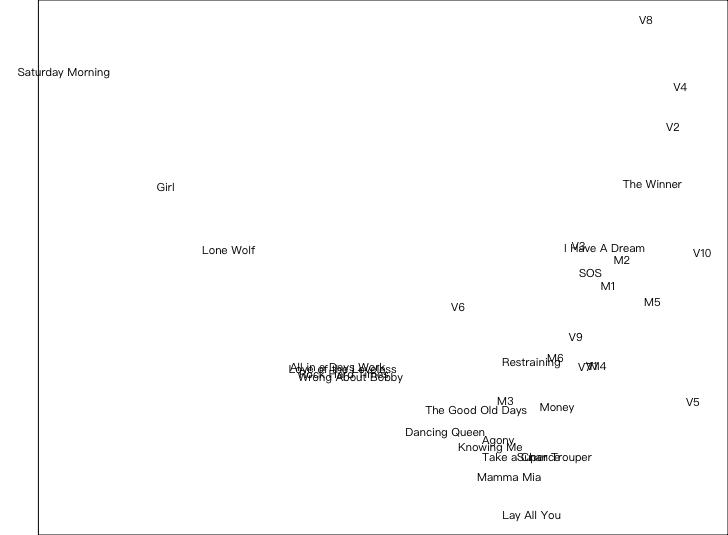
There are also some details about the main relationship of the graphic elements, which is also ours.& Base-based drawing system R One of the reasons for all the graphic details.
For example, the direction of the tic shorts of the axis is defaulted to the outward (tcl (a) Arguments) which are reasonable and may interfere with elements in the graph area if the tic line is stretched internally;
Like xaxs and yaxs Parameters, they default to allow the range of the map area to be expanded by 4 per cent, so that a small space is left between the axis and the boundary of the chart data, so that the minimum and maximum values in the data are not closely connected to the axis, and so that the main graphic elements are fully visible and free from the axis lines of the coordinates.
The symbol is clearly divided.
We'll use a lot of symbols in a picture, and in order to make the graphic clear and distinguish, we should try to select the more differentiated symbols.
Carefully processing data
Usually, data can only be processed to reveal the information we want to know, for example, that giving all of us a height data profile in the country will only drown us in numbers, but an average or median can tell us the average of height. This may be the reason why people develop habits for processing data, but it is often a disaster for statistical graphics, and valuable raw information is destroyed by human processes.
In graphics, we advocate that raw data be expressed as far as possible, rather than being processed by humans, including
- Do not omit data
- Do not separate the data
One of the advantages of graphics compared to tables is that it displays much information in smaller spaces, and we hardly have to deliberately delete the raw data and draw them, and even if they are necessary, then it is usually decided to look at local data after looking at the complete picture.
Dispersional data are the more common data-processing tool and its shortcomings are less easily detected, often because of the inertia of previous behaviour and the temptation of those disaggregated data-processing methods; In fact, discrete data loses the original information and the arbitrary division of the area often leads to errors due to the inappropriate division of the area.
Nor can we absoluteize the principle of "no data processing" and in one case processing data would make the graphics more explicit, i.e. data that are not readily visible from the original data; for example, differences in the two sets of decorative lines, or differences in the two data sets, or observation of growth rates, where the deviation would allow us to better observe differences
There is also a situation where there may be a need to process data slightly, and when there are many overlaps in the data, we have to find ways to allow readers to read these overlaps, and randomly to disrupt the location of the data points is a way to do it, but don't forget to remind readers of our operation, otherwise they will not realize that we've been messing with it.
Ink saving
Turning to ink, we have to mention the visualized master Edward Tufte, who invented an interesting word, "chartjunk," which is a surplus in a graphic that does not help in the expression of data, or even conceals or distorts information in data.
We can give a classic chartjunk, and he shows only five figures, five years, the percentage of admission to U.S. universities at 25 years old.
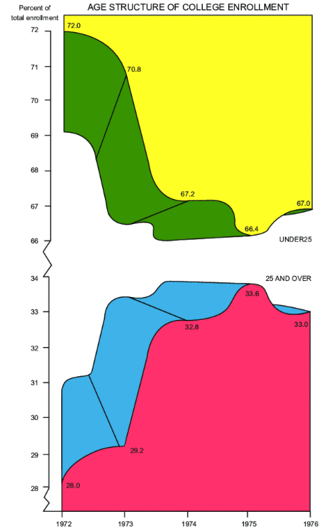
One graphic can be decorated in one of three ways, one in a color that is frowning, two in a 3D effect, and three in a disguise that is as rich as it is, using all three means -- Michael Friendly.
Design Layout
Here we would like to introduce the vertical comparison, which is a concept that is very important for graphic interpretation, especially the contour. In short, the vertical-to-penetrating effect is the ratio of the graphic elements to the width. The figure for "skinny" is very steep, and the sense is that the trend is very sharp, while the figure for "skinny" is that the trend seems to be smoother.
R. Common in basic graphics systems asp Parameter-argument ratio
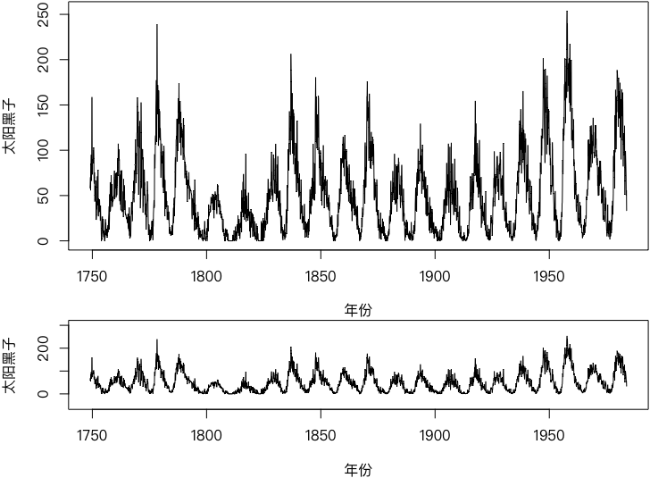 I can see from the following figure. The number of sun darks rises faster than the rate of decline. This is the sense of deception of readers through vertical matching.
Cleveland's suggestion on this issue is to adjust the vertical-and-arrange angle average of all the cones to close to 45∘** Because people's eyes are the most accurate of the angles around 45 gills, and they're all too big or too small.
With explanation
Although we say "a picture is a success," the graphic itself may be interpreted differently for different readers, even if some readers do not necessarily understand what a picture really means, and it is necessary to provide accompanying explanations at this point.
There are two ways to explain by-product, one by adding a reference to the text, which is very limited because the space in the picture is limited and too many text indications may lose the focus of the graphic itself
The other way is to use the title of the chart, which seems to be relatively good in the English literature, which usually has a clear title and which is like a complete phrase, but in most Chinese literature the picture is as plating as a text, the title of the chart is only one sentence, and the explanation of the chart is usually in the body of the text, which may prevent readers from focusing on the reading of the graphic, as it needs to be read back to the body of the text with the corresponding explanatory text.
Our suggestion is that we can get the reader to understand the implications of the graphic as much as possible by combining the content of the graphics with the simple understanding of the article in the brain; that requires that our title be a short but complete story.
Think about it.
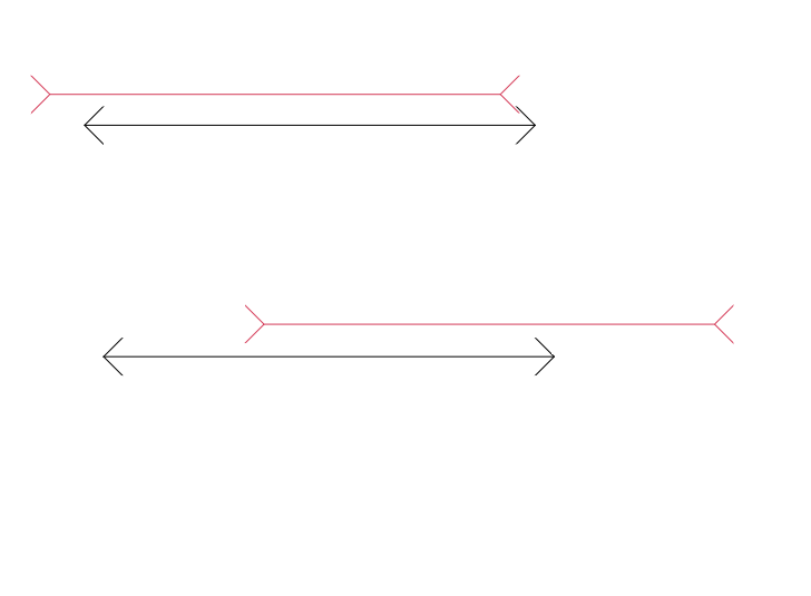 It's a classic visual deception. Red and black are essentially the same length.
And similarly, we have some of the graphic psychology that has been studied.
- Red is exaggerating, so the red area may look bigger than it really is.
- The color of filling in the larger area seems to be deeper than the smaller area.
- The same angle may be placed in different directions, which may make it look different, for example, from a horizontal angle and from the same angle of 45 ∘ angles, which may affect the interpretation of the pie.
Final summary
We've been presenting a lot of statistical data, but they're not completely, or just the tip of the iceberg, for the following reasons.
- So far, R packages have exceeded 2w, and many authors design the function of drawing, and it's impossible to introduce it completely.
- The graphics in many statistical packages are not very different in their use, for example, many packages have chosen extended and extended functions.
plotTo achieve your own effects - Many of the parameters in the graphics are actually the same or close.
Of course, R's graphic system is also very deficient.
- Graphics are unedited. You want to change them, you have to redraw the whole picture.
- We still need to work slowly to get the desired effect.
- Lack of interactive graphics
- There's something unreasonable about the details.
plotDefault hollow circle. Data is hard to highlight.
Here's the graphics, and then we'll show some of the drawing systems in R.
R Basic Mapping System
The statistical graphics of the R base mapping system are generated by a function, and his core is in the R base package. graphics A large number of developers have expanded a series of derivative packages based on this, and they all form the grammar rules of the basic system.
Sometimes we have our own personal requirements for statistical graphics, and this is when we fine-tune the details, and here we are talking about the details.
Two Graphical Functions
plot function
The most common graph function in R is plot() function, it is a generic function that allows many different categories of objects to be accepted as their graphic object parameters; we are here to explain only the graphic parameters, not the graphic object parameters.
First introduce plot() Common parameters:
type
Graphic style type, with nine possible values, representing different styles:
'p'- Drawing points;'l'⇒ Paint lines;'b'(b) The drawing of points and lines at the same time, but not the intersection of the lines;'c'⇒ Generaltype = 'b'The midpoint is removed and only the corresponding line is left;'o'♪ And draw points and lines, and overlap, and it's withtype = 'b'(b) Distinctions;'h'• Draw lead lines;'s'Draws a ladder, from one point to the next, horizontal lines and vertical lines;'S'The tectonic line is also a line of drawing, but the vertical line is drawn from one point to the next, and horizontal lines are drawn;'n'⇒ Make an empty map with no content, but all other elements such as the axis, the title, etc. are shown as such (unless hidden in a different setting)
main sub xlab ylab
Main title Subtitle x-axis label y-axis label
asp
Graphical vertical ratio, i.e. ratio of 1 unit length on y axis and 1 unit length on x axis; normally, this ratio is not 1, and in some cases it is necessary to set up to show better graphic effects, e.g. the slope that needs to be expressed in a straight line from angle: If asp Not equal to one, so 45-mile angles may not look like the real 45-mile angle.
x, y
Two vectors to make a scattering chart; if y is missing, x is the position of its elements (in %2)1:n ) to create a scattered map
xlim, ylim
Sets the limit of the coordinates system, both parameters take a vector of 2 in length and they work similarly par() Medium usr But we can do it. par()$usr The coordinates of the given map are obtained, and this function is not available for both parameters, as normally the charting function does not return any value (or the return value is empty):NULL)
log
Whether coordinates are logarithmic, values are taken 'x' The text of the article is reproduced below:'y' The #symmetrical #symmetrical #symmetrical #symmetrical #symmetrical #symmetrical #symmetrical #sympic #symphosmpic #sympic #symphosmphos #symphosympic #sympic #sympic #symphos-ymphos #sympic #sympic #symphos #symphos #sympic #symphos #symphasym'xy' Both coordinates are in logarithmic.
ann
Some default marks are shown, such as coordinates of axes and graph titles
axes
Whether or not to draw the axis; care will affect only the drawing of the axis and the scale, and not the title of the axis
frame.plot
whether to box the graphics;available box() function, functions similar but more detailed
panel.first
Work to be done before drawing; this parameter is often used to add a background grid or a smooth curve of a scatter point before drawing, for example panel.first = grid()
panel.last
Tasks to be completed after drawing; similar to previous parameter
Besides the initial:
col, pch, cex, lty, lwd
Meaning of these parameters par() And the parameters in it are basically the same, and the difference is,par() , and this is the only single value that can be set here, and this vector is applied in turn to each element, and if the vector length is shorter than the number of elements, the vector will be recycled until all elements are drawn, and in fact the recycling of the vector is a major feature of the R graphic parameter.
bg
background colour; attention and par() The difference is, it's set only to draw the background color, not the whole picture!
Par Functions
The graphic parameter for R can be used both by function par() Pre-global settings, which can also be used for specific graphic functions (e. g. plot()、lines()) sets the temporary parameter values;
The difference between the two is that the former setup will always work in the current graphic device, unless the graphic device is shut down, while the latter setup is only temporary and does not affect the graphic effects of other graphic functions that follow.
Functions par() It covers most of the graphic parameters, and therefore is described in a dedicated section.
Functions par() You can set or get graphic parameters.par() Returns the current graphic parameter settings (a list) to the extent that they are available for setting graphic parameters. par(tag = value) Form
Current par() The function involves approximately 70 graphic parameters, which are used to explain the common and more understandable parameters.
adj
Adjusts the relative position of characters in the diagram; values are given in a numerical vector of 1 length, usually in [0,1], 0 for left alignment, 1 for right alignment; in text() function, the length of which can be 2 and the adjustment of the lower left angle relative to the point (x, y) of the character boundary rectangular, respectively, is also generally in the range [0,1] of the vector, which can also be exceeded in some graphic devices, and the ratio of the string to the left, which is based on the lower left, moving to the left and down, depending on its width and height, is defaulted. c(0.5, 0.5)I'm sorry. For example, c(0, 0) The lower left corner of the whole character (string) is the point of the given coordinates, and c(1, 0) is the distance of the string that moves its width horizontally, without vertically affecting it.
ask
Switch to the next new graphic device (usually a new one) if the user needs to enter (knock back the car key or click the mouse); TRUE indicates; FALSE indicates no. It is useful when multiple maps are presented on each of them and need to be displayed on graphic devices in sequence, if set ask Yes TRUE, then every new picture will be made before the user enters it, or all the images will be flashed.
bg
Sets the graphic background colour;
bty
setting graphic border styles; taking values to characters o, l, 7, c, u, ] one;the shapes of these characters themselves correspond to border styles, such as (default values)o It means that all four sides are shown, and c This means that the right side is not shown
cex
The zoom factor (text and symbols, etc.) in the figure above is multiplied; the value is a value relative to 1 (default is 1). The specific detail can be scaled by the following parameter settings (the default values are 1:
cex.axis
Multiplier of coordinates of coordinates of scale marks
cex.lab
Multiplier of coordinates for axis titles
cex.main
Multiplier scaling of main title of the figure
cex.sub
Multiplication of the figure by subtitle
col
(a) the colour of the symbols (points, lines, etc.) in the figure; and cex Parameters similar
col.axis
Colour of coordinates tic marks
col.lab
Colour of coordinates for axis title
col.main
Colour of main title of the figure
col.sub
Colour of the byline title of the figure
family
Sets the font family of text (breadline, liner, equal width, symbol font, etc.); standard values are:serif, sans, mono, symbol,
fg
Sets the foreground colour (if no other color settings are specified later, this parameter affects almost all the subsequent graphic elements colours, and if the subsequent graphic elements have specified colour settings, only the colours of the graphic border and the coordinates of the axis lines);
font
Sets text font styles; takes value to an integer; normally 1, 2, 3 and 4 means normal, bold, italics and bold italics respectively; for additions,text() Functions and vfont Parameters can set more detailed font family and font styles; see these two presentations:demo(Hershey) and demo(Japanese)The former demonstrates Hershey vector fonts, the latter expresses Japanese;
font.axis
Font style for the coordinate axis tic label
font.lab
Font Style for Coordinate Axes Titles
font.main
Font Style for the main title of the figure
font.sub
Font Styles for the Figure Subheading
lab
Sets the number of coordinates of the axes (R will automatically "take" as much as possible, i.e. as close as possible to the arc of 0.5, 1 or 10); the form of the value to be taken c(x, y, len):x and y Sets the number of tics for each of the two axes.len Currently not in effect in R, setting any value is not affected (but is used) lab This parameter must be written when you are using it)
las
Coordinate axis label style; take one of the four integers, 0, 1, 2, 3 and 1, respectively, indicating " always parallel to the axis " , " always horizontal " , " always vertically " and " always vertically " .
lend
style (round or square) at the end of the line; values are either 0, 1 or 2 integers (or the corresponding string) 'round', 'mitre', 'bevel') , watch the fine differences between the two
lheight
Line height in figure Chinese; value taken multiple, default 1
ljoin
style for the intersection of lines;the value is either 0, 1 or 2 integers (or the string of the string) 'round', 'mitre', 'bevel') means drawing round corners, drawing square corners and cutting the top angles
lty
Lines are fake styles: 0 ⇒ without drawing, 1 ⇒ solid, 2 ⇒ dotted, 3 ⇒ dotted, 4 ⇒ dotted, 5 ⇒ long underlined, 6 ⇒ long underlined; or the following string is set accordingly (for the preceding numbers):'blank', 'solid', 'dashed', 'dotted', 'dotdash', 'longdash', 'twodash'; also indicates the length of the line in the line and the blanks in a string consisting of a hexadecimal number, if 'F624'
lwd
line width;default 1
mar
Sets the width of the graphic boundary in the whitespace; by default, in the order of " lower, left, top, right " c(5, 4, 4, 2) + 0.1
mex
Sets the width of the axis to be multiplied by the width of the boundary; default is 1 and this parameter will affect mgp Parameters
mfrow, mfcol
setting a page of multi-graphs; taking the form of values c(nrow, ncol) Vector with 2 length, set rows and columns, respectively
mgp
Sets the width of the boundary of the axis; the numerical vector with a value of 3 is the width of the axis title, the coordinates tic line label and the coordinates axis, respectively (acceptance) mex ) , Default is c(3, 1, 0), meaning that the coordinates are 3 and 1 and 0, respectively, from the coordinates ' axes, coordinates ' tic line labels and coordinates ' axes;
oma
Sets the width of the outer boundary (Outer Margin); similar mar, Default is c(0, 0, 0, 0), when only one chart is displayed on a page, the parameter is compared to mar It's not a good distinction, but it's easy to see the difference between mar The difference.
pch
(a) The symbol of the point;pch = 19* The point of the square,pch = 20⇒ Small solid dot, pch = 21 ⇒ circle,pch = 22Zirconium square,pch = 23♪ ♪ The oil ♪pch = 24♪ ♪ Right on the triangle, ♪pch = 25⇒ Tile-tip, where 21-25 can fill colours (using bg (parameters)
pty
setting shapes for the chart area;defaultly as 'm': Maximize the map area; another value 's' Means that the set-up-charted area is square
srt
rotation angle of string; taking an angle value
tck
Height of the axis tic line; take value is the ratio to the width of the graphic (between 0 and 1); positive value is the internal graph line, negative value is the outward; default is not using it (set to NA) and uses tcl Parameters
tcl
coordinates the height of the axis tic line; taking a ratio to the height of the text line; positive or negative meaning tck, the default value is -0.5, i.e., an outward drawing line, with a height of half-line text;
usr
Range limit for the chart area, with a value of 4 value vector c(x1, x2, y1, y2), which means the right and right limits of the x axis and the lower upper limits of the y axis in the map area; note, if the coordinates are taken as logarithmic (see xlog, ylog The actual limit is set at 10 corresponding tacks. Number of times
xaxs, yaxs
coordinates range calculations;default 'r': extend the range of the original data by 4% and then draw the axis of the coordinates with this range; another value `i' indicates the direct use of the original range; there are actually other methods of calculating the range of the coordinates, but they are not presented as they are not currently in force in R
xaxt, yaxt
coordinates axis style; default 's' as standard styles;other value 'n' It means no coordinates.
xlog, ylog
whether coordinates are to be taken as logarithm; default FALSE
xpd
handling of graphics beyond boundaries; taking values FALSE: Limiting graphics to the graphics area, and removing the graphics from the boundary; take values TRUE: Limiting graphics to graphics, and removing the graphics from the boundary; taking values NA: Limit graphics to the device area Internal
The role of these parameters need not be so well understood; this chapter can be used as a reference only and can be consulted as needed
After we've finished the argument, let's just say par() The usual technique. As mentioned at the beginning of this section, this function changes the pattern setting, and we do not sometimes want this function, especially when we wish to be restored after a picture is finished and the next one is prepared.
And then we need to save the drawing parameters to an object before we start a map, for example. op = par(), and then we can use it in the making of this picture par() Function changes any settings that are appropriate to the needs, and we'll use them after this picture is finished par(op) statement sets the previously saved parameter " Release " out so that the changes to the graphic parameter by the intermediate process no longer affect the next chart.
Of course, every drawing that is done can also turn off the graphics device and then make the next one, which can also serve its purpose, but only to a lesser extent, especially when it is repeated, adjusted and compared, and then it becomes more cumbersome to turn off and open the graphics.
Colour
The color is the most important element in the graphic.
By default, the settings for the colour in the R will depend on grDevices Package support, which provides a large number of colour selection and generation functions, as well as several preset palettes to express different themes. We'll go down to the next level.
graphicsThe package supports three drawing colour parameters: col bg fg The colour of the elements, the background colour, the foreground colour, are used separately; this rule is also absorbed in other drawing packages.
Fixed Colour Selection Function
Fixed Colour Selection function is the color that R provides for bringing a fixed type of color, mainly a function colors()
colors(), colours()The two functions are identical, they are two different spellings in English, they do not require any parameters and generate 657 colour names
We can use names to call these colors, and R, of course, assigns numbers to common colors, one to eight, so the color vector can be used as a color vector.col bg fgvalue of the parameter
Colour Theme Palette
The colour generation process described above may be too complex for the general population. At this point, R offers a third option, the colour palette for a specific color theme. These palettes present specific themes in a series of gradients, such as rainbow colour series, white thermal colour series, topographic colour series, etc.
rainbow()By definition, it's the rainbow color that produces a series of colors.
heat.colors()Gradual change from red to yellow to white (to reflect "high temperature", "white heat")
terrain.colors()Gradient green to yellow to brown to white.
topo.colors()Gradually from blue to cyan, to yellow and finally brown.
cm.colors()From the cyan to the white to the pink.
These palette functions help us generate some colour pools that we can call directly.
Type Palette
Of course we can be more impatient. Package RColorBrewerThree types of palette are provided, and users can use the colour palette name in the package brewer.pal() function to generate colour. These three types of palettes include:
- Continuous palettes generate a series of successive gradients that usually mark the size of the continuum values
- Extreme palettes Points
- Dispersive palettes generate a series of more distinct colours that are usually used to mark classified data
brewer.pal()You return the colour vector.
RColorBrewer The bag is also available. display.brewer.pal() and display.brewer.all() function that shows the selected palette or all palettes in the graphic window.
The blog also provides a detailed explanation of the situation.RColorBrewerIt's very easy to use.
Colour Generation and Conversion Functions
R A range of colour-generated models is available, such as the RGB model (Red Green Blue Three Colors Mixed), the HSV colour model (Colour, Saturation and Purity), the HCL colour model (Colour, Color and Brightness) and the Grey Generation model. The structure of the colour is complex and beyond the scope of the book, so here only the use of the function is described.
rgb()The three-plattered blues and red. rgb(red, green, blue, alpha, names = NULL, maxColorValue = 1)
hsv()Construct colours with Hue, Satouration and Value hsv(h = 1, s = 1, v = 1, alpha);
hcl()Construct colours with Hue, Chroma and Luminance, as hcl(h = 0, c = 35, l = 85, alpha, fixup = TRUE);
gray(), grey()Generate grey series; only one parameter level, indicating the greyscale level, with values ranging from 0 to 1
rgb2hsv()Convert RGB colour to HSV colour, usage rgb2hsv(r, g = NULL, b = NULL, maxColorValue = 255)
col2rgb()Convert any R colour value to RGB, usage col2rgb(col, alpha = FALSE)
Drawing Elements
The statistical graphics are made of elements, and here we are presenting the bottom elements, the advanced graphic functions we use are essentially to generate these elements by certain patterns and wrap them up into a function for us to use, which is useful for people who want to get to the bottom of R.
Points
For point settings, we can use both many graphic functions pch And so on, it can be done with lower layers. points() Add a point to an existing graphic to achieve
We're here to highlight the importance of this.
lwdParameters, which we know are the width of the line, can also set the edge "line" width of the point for point purposes;pchParameters can also accept characters as parameter values, not just numbers;- Finally, parameters
pchThe point from 21-25 can fill the background colour
Line
We can use a function. lines() to add a curve to the chart (the curves in this context are essentially links to some segments of the line, not smooth curves); the following is a brief addition to the line style: lty Settings
R can achieve almost a million lines because of its lty The parameters are flexible, and apart from the values 0-6, the lines can be set in the form of a hexadecimal digital string (digits must be even and not zero).
For the straight line, we need only determine the position of the plane coordinates by two factors: the slope and the cut-off. Functions abline() It's for adding a straight line.
Lines can be used for functions segments() Generate
The sample is a curve that links several data points with a smooth curve xspline It's the method of generation.
Arrows can be used for functions arrows()Generate
Rectangle, Polygon
R is also easy to draw polygons, mainly for use polygon() Function, rectangle is a special case of polygon, but R also provides a specific function rect() Here, draw it.
There's a special rectangle, which is the frame of the whole picture, and it can be used. box() Function to complete
Grid Lines
Sometimes, in order to facilitate graphic readers to know the more precise location of the elements in the diagram, we can help the reader to align the axis with the view of the grid by adding a background grid. Functions grid() And that's what it's all about.
Title Any text Periphery text
All text in the graphic can be divided into three categories: title (main subheading and coordinate axis heading), any text and graphic surrounding text.title() function to add a title,text() function to add text to any position in the graphic.mtext() Function to add text to the four sides of the chart
Legend
Functions legend() The function is to add legends
Coordinate axis
Sometimes we need to make special arrangements for coordinates, for example, to make a two-coordinate axis, or to use special text in coordinates markings, so we have to use it. axis() Function to support the completion of the alignment and adjustment of the axis
Gradient Declination Algorithm
We should understand R's freedom to make drawings -- we can control almost all the details of the graphics -- and consider using them to visualize the gradients.
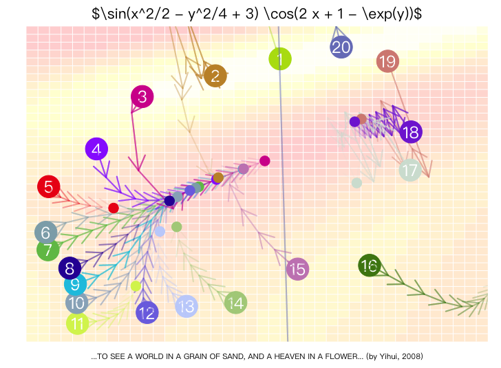
Specific function realization to refer to in MSG package msg("9.22")
One page of multi-graph
Sometimes we need to place multiple graphics in the same page to compare them or to make them more beautifully organized. In this case, we have at least three options:
Set graphic parameters
We talked about it once. mfrow and mfcol Two parameters if we're in par() function, then the next graphics will be created by the number of rows and columns set by these parameters, which is the most common graphic layout method
The limitation of these two parameters is that they can only split the graphic area into grids, each of which must be equal in length and width, and each of which must have a graphic that does not allow for the function of a graphic in multiple cells.
Set Graphical Layout
R provided layout()Function as a tool to set the split of graphic layouts
matParameters are a matrix that provides the order of the drawings and the arrangements for the graphic layoutwidthsandheightsProportion of rectangular regions long and widerespectControls whether the scale of the length of the vertical axis inside the graphics is the samenSerial number of the area to display
Graphical Devices
Utilization grDevices Several graphic devices in the package, which we can output the R graphics into files in various formats, including bitmap files (BMP, JPEG, PNG, TIFF) and vector chart files (PDF, EPS) and TeX or LaTeX files
Basic graphic device function has bitmap device bmp()、jpeg()、png() and tiff()and vector-mapping devices svg()、postscript() and pdf(), all R graphics are generated in the graphic device after opening the graphic device, and will not be shown in the window until the graphic device is shut down.
tikzDevice The package is more friendly to the output of the graphics, and it's better to use it to control the output of our graphics.
Diagram Devices support the use of Chinese or other CJK characters in graphics, but font family parameters are required when using Chinese characters in vector chart devices familyOtherwise, Chinese will not be shown (e.g., Chinese should be used) pdf(family = 'GB1') The problem arises in exporting EPS formats.
Math Formula
Since mathematical symbols are often required in statistical theory, adding some mathematical descriptions to statistical graphics not only makes the graphics look more professional, but also adds significantly to the theory behind the graphics.
R's. grDevices The package provides a series of mathematical formulae with symbols that he can help us insert into the graphics. ?plotmath You can see help.
If you want to add a text label to the map for mathematical expression, you just have to set the text to the expression type.
tikzDevice The package can also help us generate better-quality mathematical formulae, and this extension was released in 2020, which is more friendly to the Latex syntax.
ggpllot2 graphics system
The basic graphics system is flexible, but the options are varied and dispersed. ggpllot2 to The Grammar of Graphics , which is based on the theory that the graphics are to be broken down into components that can be assembled layer by layer. It expands the generic function. +, data, visual maps, geometric objects and other settings can be stacked by layers.
Basic Syntax:
ggplot() The project is designed to provide data and default visual maps.aes() Describe how the variable is mapped to cross-axis, vertical axis, colour or shape.geom_*() Add specific geometric objects,labs() , and then set the title and label. A basic example is as follows:
library(ggplot2)p <- ggplot(data = mtcars, aes(x = wt, y = mpg)) + geom_point() + labs( title = "Automobile Data", x = "Weight", y = "Miles Per Gallon" )
在已有图形上增加平滑曲线
p + geom_smooth(method = "loess")
输出没有平滑曲线的原始图形
print(p)
ggpllot2 automatically adjusts the margins, selects the colour from the palette and generates legends when needed. It is usually only necessary to clarify the data and mapping relationship, and the remaining details can be progressively supplemented in the various layers.
The system consists mainly of geometric objects (geom), statistical transformation (stat), scale (scale), coordinates (coordinate system), facet and theme (theme). There are many extension packages around this syntax that can add new graphic types, scales and themes.
Geometric Object
Geometric object abbreviations géom, including points, bars, lines, box charts and text. They are similar to basic graphic elements, but more encapsulated. For example, the box diagram, smooth curves and slides are all statistically calculated, and in ggpllot2 only the corresponding call is required geom_*() function.
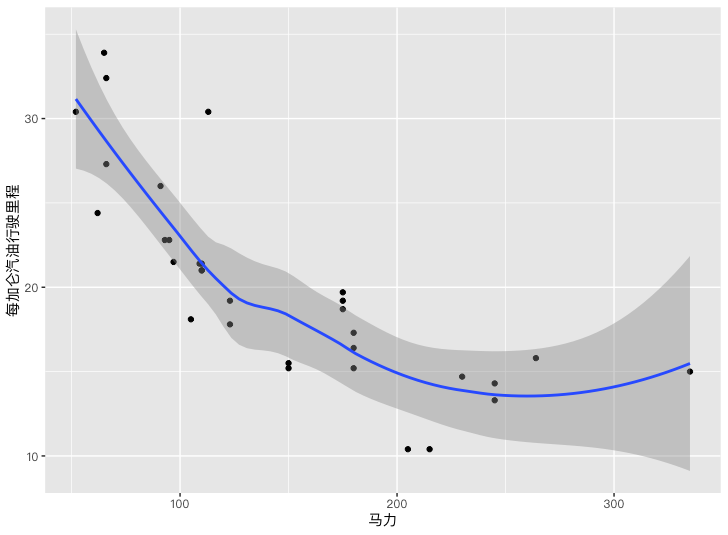
# 汽车马力与每加仑汽油行驶里程的关系 library(ggplot2)p <- ggplot(data = mtcars, aes(x = hp, y = mpg)) + geom_point() + geom_smooth(method = "loess") + labs(x = "马力", y = "每加仑汽油行驶里程")
print(p)
ggplot() Specifies the data source and variables, the geometry function determines how these variables are expressed as points, bars, lines or shadow areas. Common functions are as follows:
| Functions | Geometric Object |
|---|---|
geom_bar() |
Bar Chart |
geom_boxplot() |
Line Chart |
geom_density() |
Density Chart |
geom_histogram() |
Histogram |
geom_hline() |
Horizontal Line |
geom_jitter() |
Shake point |
geom_line() |
Line |
geom_point() |
Scatter Chart |
geom_rug() |
Axis of coordinates |
geom_smooth() |
Compressing Curves |
geom_text() |
Text Notes |
geom_violin() |
Fiddle Chart |
geom_vline() |
Line |
Geometric functions also accept a set of common parameters:
| Parameters | Meaning |
|---|---|
color |
colour of the object boundary or line; color map refersScales and Grouping |
fill |
Fill colour inside the object |
alpha |
Transparency, values range 0 to 1 |
linetype |
Line type, as solid, dotted and nodal |
size |
size of points; also for width in old version ggpllot2 |
shape |
The shape of the dot, seePoints in Basic Graphics |
position |
Bar-forming, or overlap-resistant points |
sides |
Position of coordinates |
width |
Geometric width of objects |
Statistical transformation
Statistical changes specify how to process raw data and then hand over the results to geometric objects. Common operations include the statistical frequency of the histogram, the calculation of the fractional number and the estimated density. ggplot2 also supports two-dimensional boxes, such as the measurement of observations in each region after dividing the plane into hexagonal.
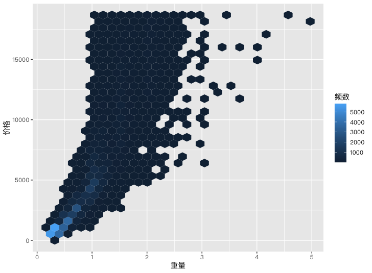
# 钻石重量与价格的蜂巢图 library(ggplot2)p <- ggplot(data = diamonds, aes(x = carat, y = price)) + geom_hex() + labs(x = "重量", y = "价格", fill = "频数")
print(p)
Scales and Grouping
The measure controls how the data is mapped to visual properties such as colour, shape, size and coordinate axis. Most of the time, just in the... aes() , ggpllot2 automatically selects the appropriate scale.
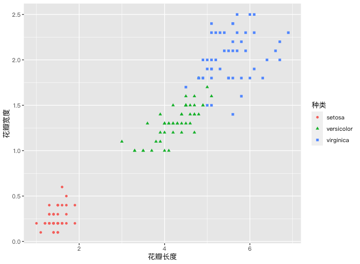
library(ggplot2)p <- ggplot( data = iris, aes(x = Petal.Length, y = Petal.Width) ) + geom_point(aes(color = Species, shape = Species)) + labs( x = "花瓣长度", y = "花瓣宽度", color = "种类", shape = "种类" )
print(p)
Grouping is used to compare observations for two or more groups in the same picture. Group Variables Generally In aes() medium; constants are written in aes() is not interpreted as a data map. The following is a coloured colour for the job title to compare the pay distribution for different job titles:
data("Salaries", package = "car")
library(ggplot2)

ggplot(data = Salaries, aes(x = salary, fill = rank)) +
  geom_density(alpha = 0.3)
You can also call again in a separate geometric layer aes()Let a map affect only this layer.
Coordinate System
ggpllot2 defaults to use the Cartesian coordinates system, which also provides polar and map coordinates.coord_flip() You can exchange x-axis and y-axis. Since the graphic is structured by layer, you can save the base graphics and add coordinates to the change.
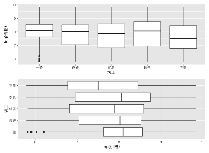
# 钻石切工与对数价格的关系 library(ggplot2) library(patchwork)diamonds_zh <- diamonds levels(diamonds_zh$cut) <- c("一般", "良好", "优质", "珍贵", "完美")
p <- ggplot(diamonds_zh, aes(x = cut, y = log(price))) + geom_boxplot() + labs(x = "切工", y = "log(价格)")
print(p / (p + coord_flip()))
Partition
The idea of the fraction comes from the Trellis graphics: first, to tear the data into a subset by one or two classification variables, then to draw separate maps using the same rules. The segment is more appropriate to observe the pattern within the groups than to overlap the grouping of multiple data sets in the same chart.
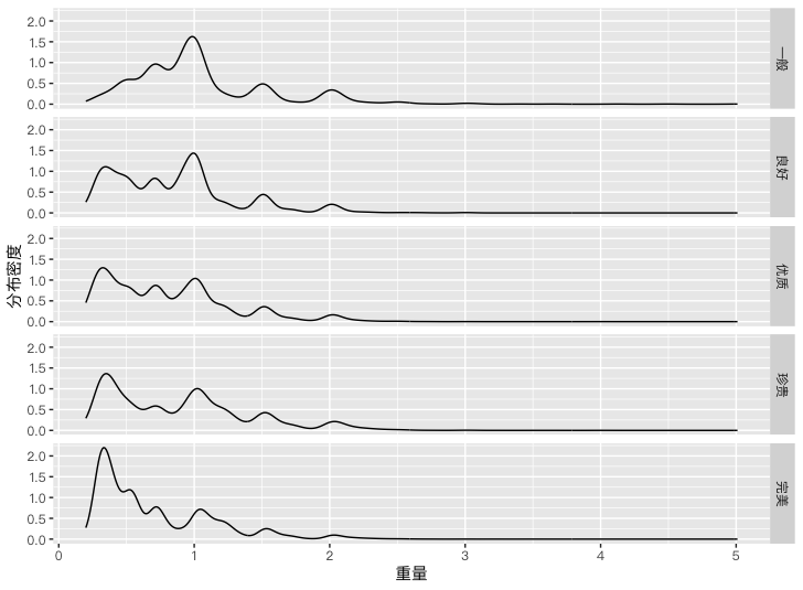
# 按切工分面后的钻石重量密度曲线 library(ggplot2)diamonds_zh <- diamonds levels(diamonds_zh$cut) <- c("一般", "良好", "优质", "珍贵", "完美")
p <- ggplot(diamonds_zh, aes(x = carat)) + geom_density() + labs(x = "重量", y = "分布密度") + facet_grid(cut ~ .)
print(p)
facet_wrap() and facet_grid() It's two main sub-functions, of which var、rowvar and colvar Both represent classification variables:
| Functions | Split |
|---|---|
facet_wrap(~ var, ncol = n) |
Press var Split up and line up. n Columns |
facet_wrap(~ var, nrow = n) |
Press var Split up and line up. n Okay. |
facet_grid(rowvar ~ colvar) |
Press rowvar Branch,colvar Breakdown |
facet_grid(rowvar ~ .) |
Every one. rowvar One line at the horizontal level |
facet_grid(. ~ colvar) |
Every one. colvar Level One |
Theme and Appearance
The default theme for ggpllot2 uses the grey background and grid lines. Grid lines help readers cross coordinates, and grey background also distinguishes the graphic from the black text in the body. Default style is not a fixed requirement and can be used theme() Changes to individual elements can also be made by switching to other built-in themes or to topics provided by the extension package.
Basic Graphics System par() It won't affect ggpllot2. The appearance of coordinates, legends and background requires the ggpllot2 own scale and theme function settings.
Coordinate axis
| Functions | Common Options |
|---|---|
scale_x_continuous() and scale_y_continuous() |
breaks Specify the scale,labels Specify the tic label,limits Control the range of the continuum axis |
scale_x_discrete() and scale_y_discrete() |
breaks Select and rank the factor level,labels Specify labels,limits Control the level displayed |
coord_flip() |
Swap cross and vertical axes |
Legend
ggpllot2 automatically generates legends based on visual mapping. Legend title usually labs() , position is passed theme() Adjustments:
data("Salaries", package = "car")
library(ggplot2)

ggplot(Salaries, aes(x = rank, y = salary, fill = sex)) +
  geom_boxplot() +
  labs(
    title = "Faculty Salary by Rank and Gender",
    x = NULL,
    y = NULL,
    fill = "Gender"
  ) +
  theme(legend.position = c(0.1, 0.8))
Legend location can be set to "left"、"top"、"right" or "bottom", you can also specify the position inside the chart in a binary vector. The previous example indicates the position of 10% from the left edge and 80% from the bottom edge. Use theme(legend.position = "none") The legend can be deleted.
Save Graphics
ggsave() You can save a graphic as a file. File extensions determine output format,plot Specify the graphic object to save,width and height Sets the dimensions.
myplot <- ggplot(data = mtcars, aes(x = mpg)) +
  geom_histogram()

ggsave(
  filename = "mygraph.png",
  plot = myplot,
  width = 5,
  height = 4
)
- Title: R Statistical Graphics: Base Graphics, lattice, and ggplot2
- Author: Hyacehila
- Created at : 2024-09-16 14:32:48
- Link: https://hyacehila.github.io//blog/2024/09/16/r-graph-learning-notes/
- License: This work is licensed under CC BY-NC-SA 4.0.